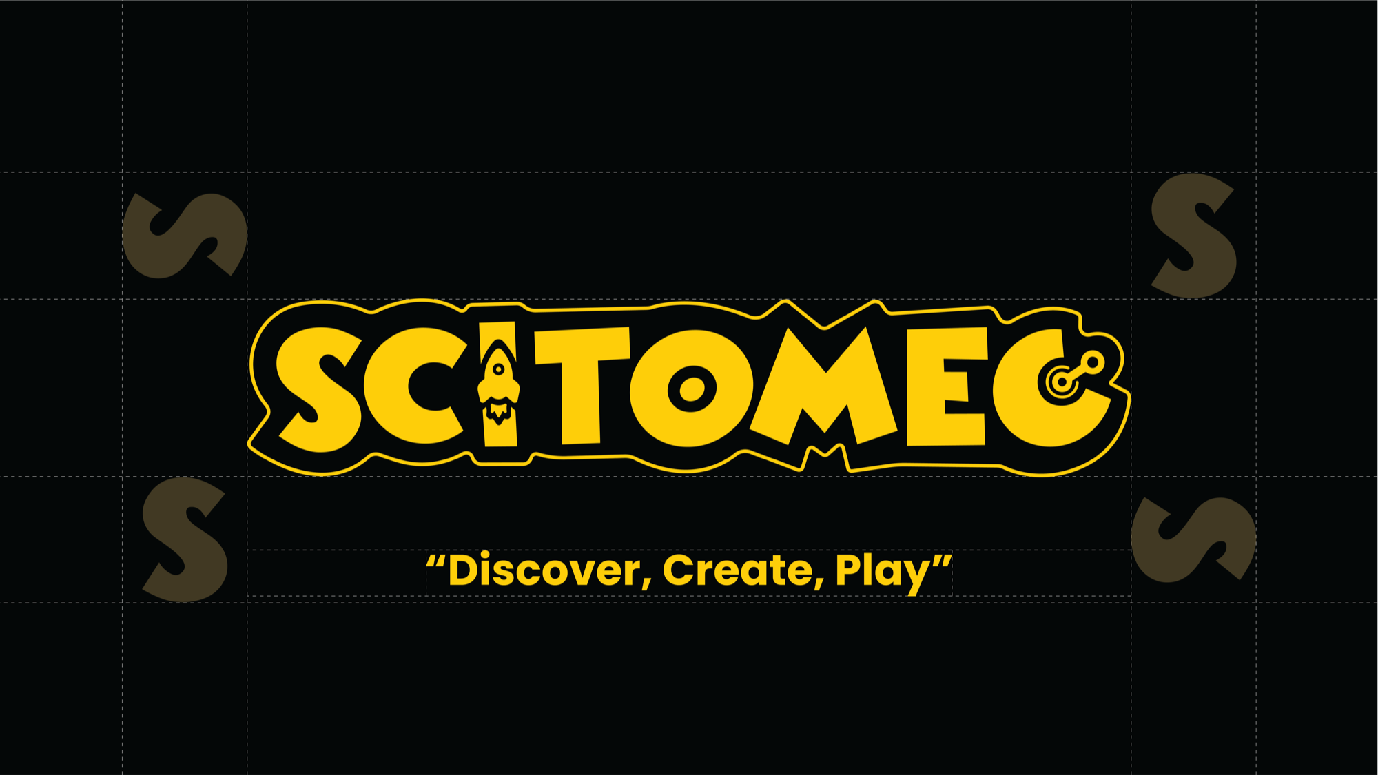
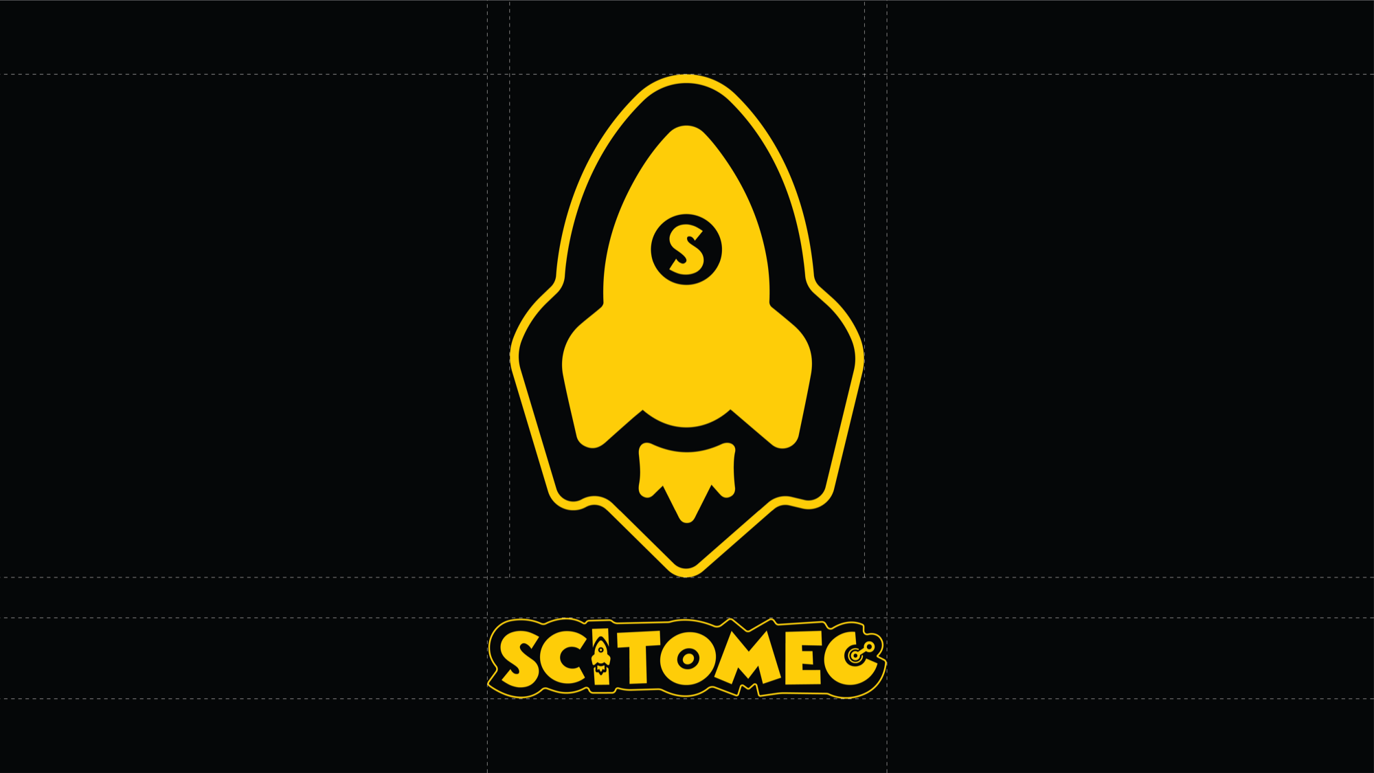
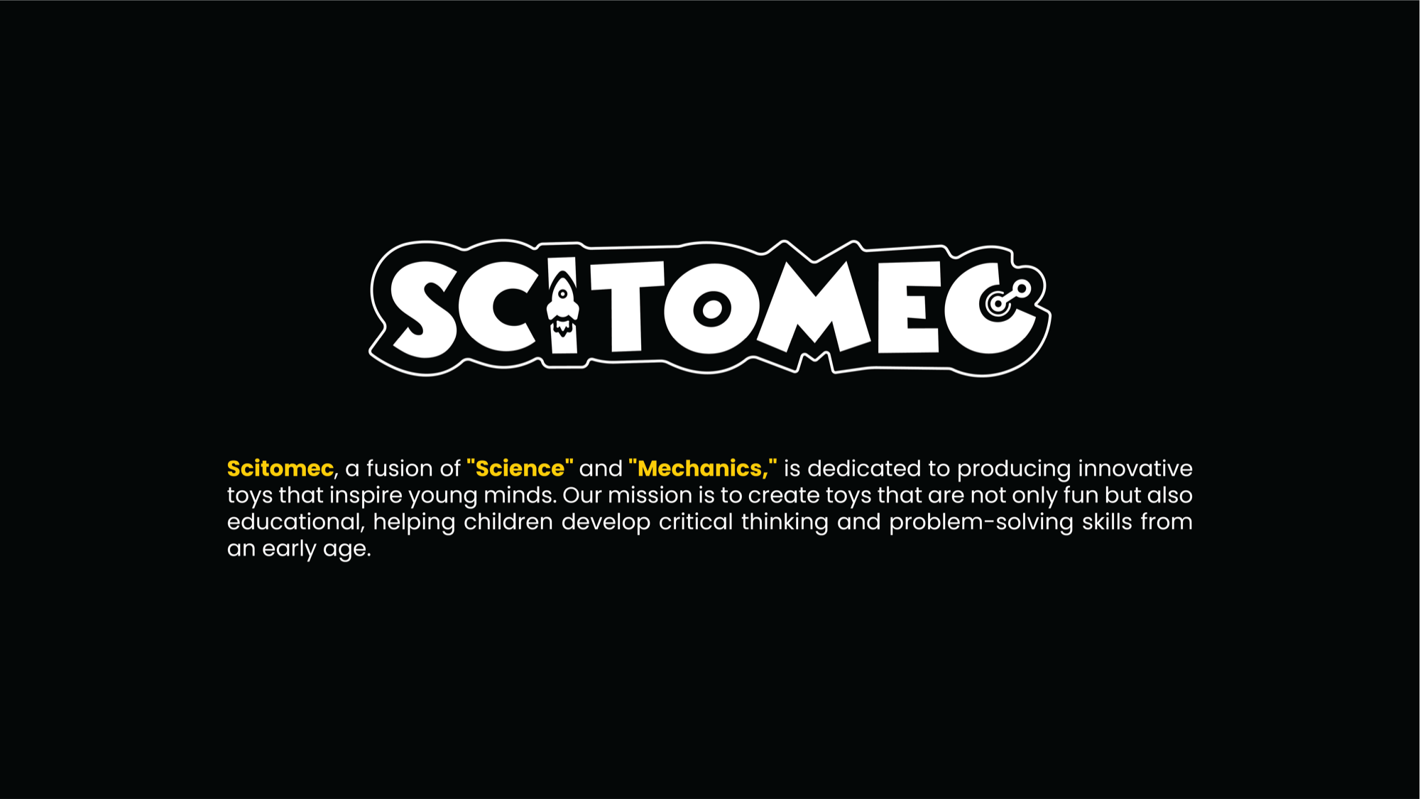
Scitomec
Brand IdentityScitomec — a fusion of "Science" and "Mechanics" — is a STEM toy brand built around a simple but powerful idea: children learn best when they're genuinely having fun. The product vision was clear from the start; the brand identity wasn't. They needed an identity that could communicate critical thinking and educational value to parents, while still being exciting enough that kids actually wanted it. Getting both audiences to respond to the same visual system is genuinely one of the harder problems in brand design, and that's exactly what made this project interesting to me.
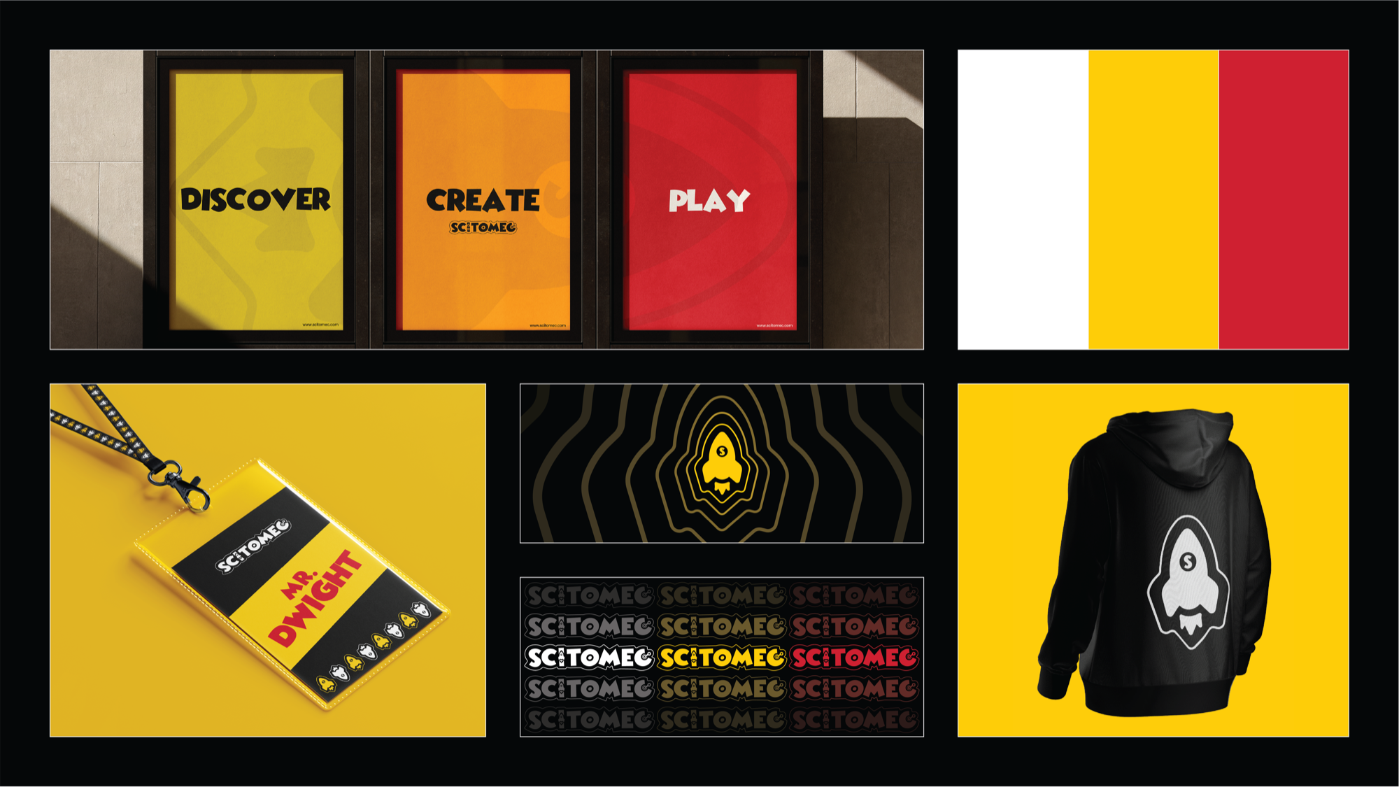
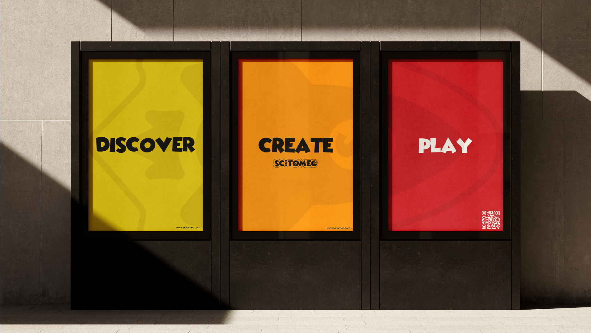
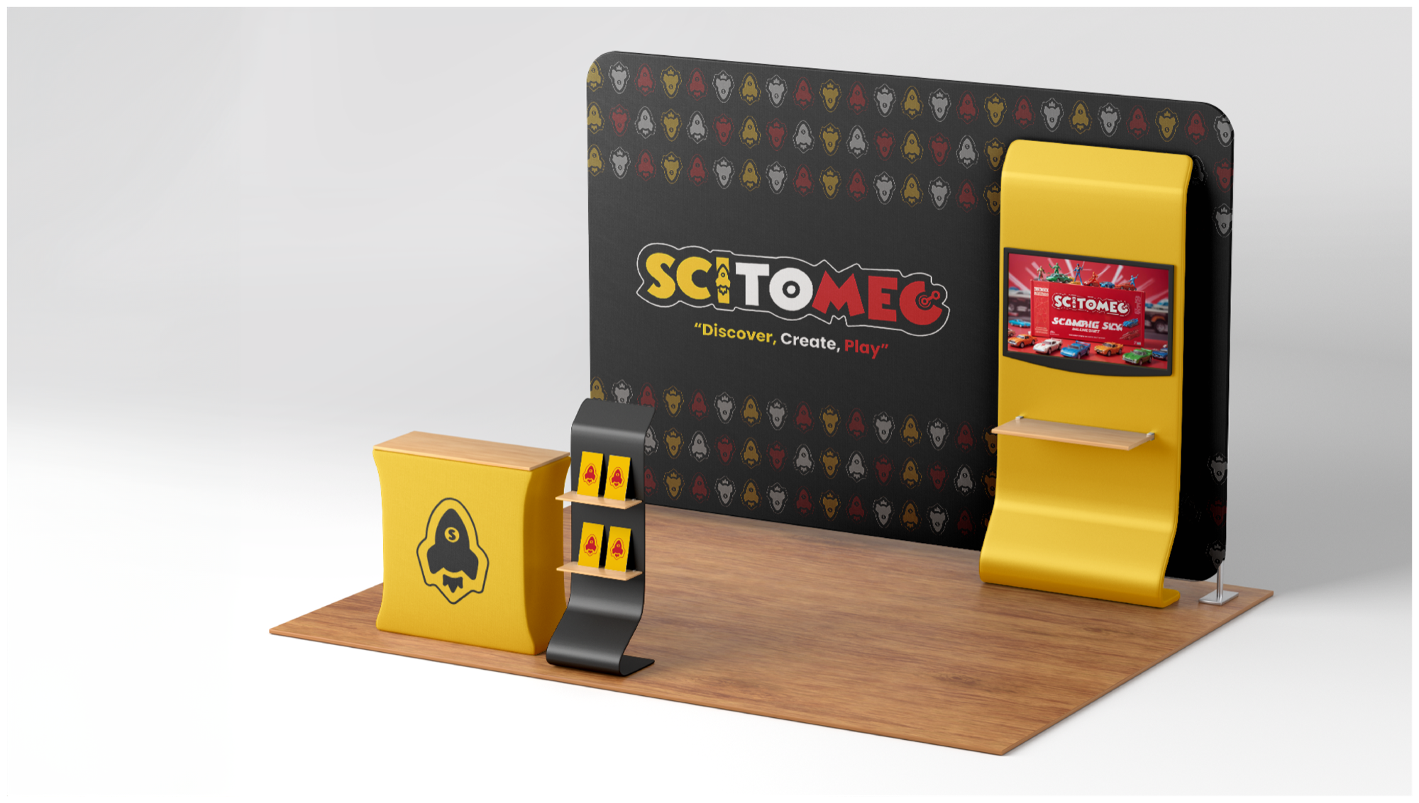
Children's brands tend to fall into one of two traps — either they're so loud and chaotic that adults tune them out immediately, or they're so focused on looking "educational" that kids couldn't care less. Scitomec needed to sit squarely between both. Credible enough for a parent making a considered purchase, exciting enough for a child who just wants to play. The three brand pillars — Discover, Create, Play — had to come through across every touchpoint, not just in the copywriting. The design itself had to feel like it was made by someone who understood what it means to be curious.
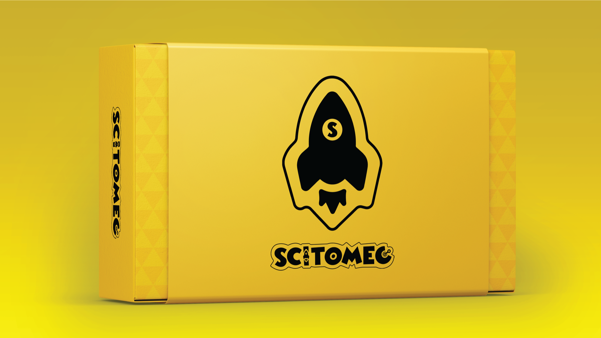
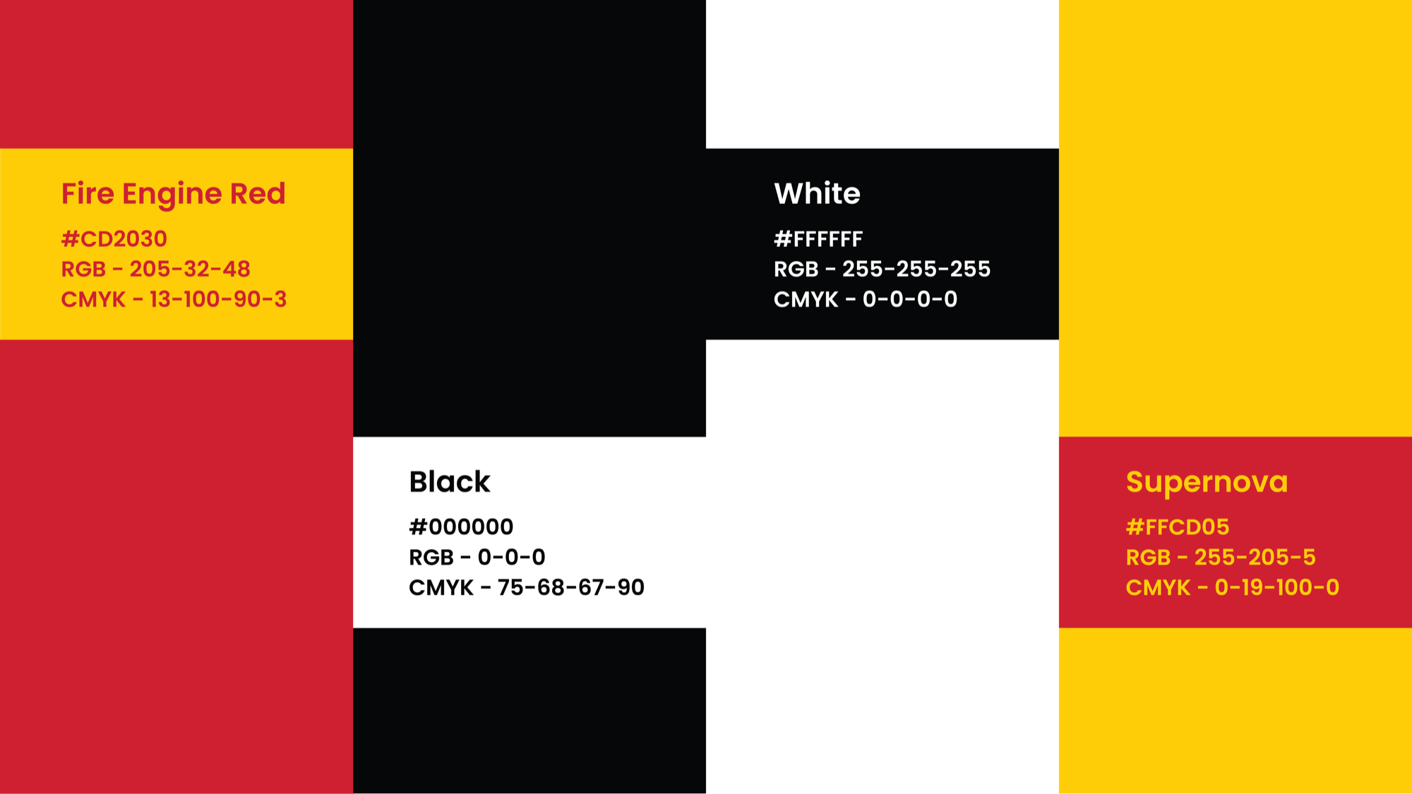
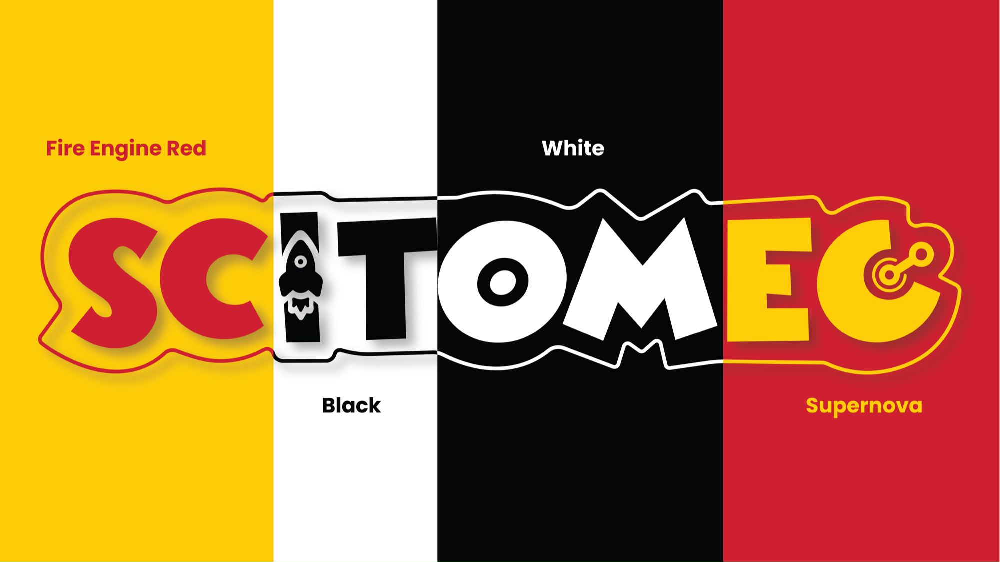
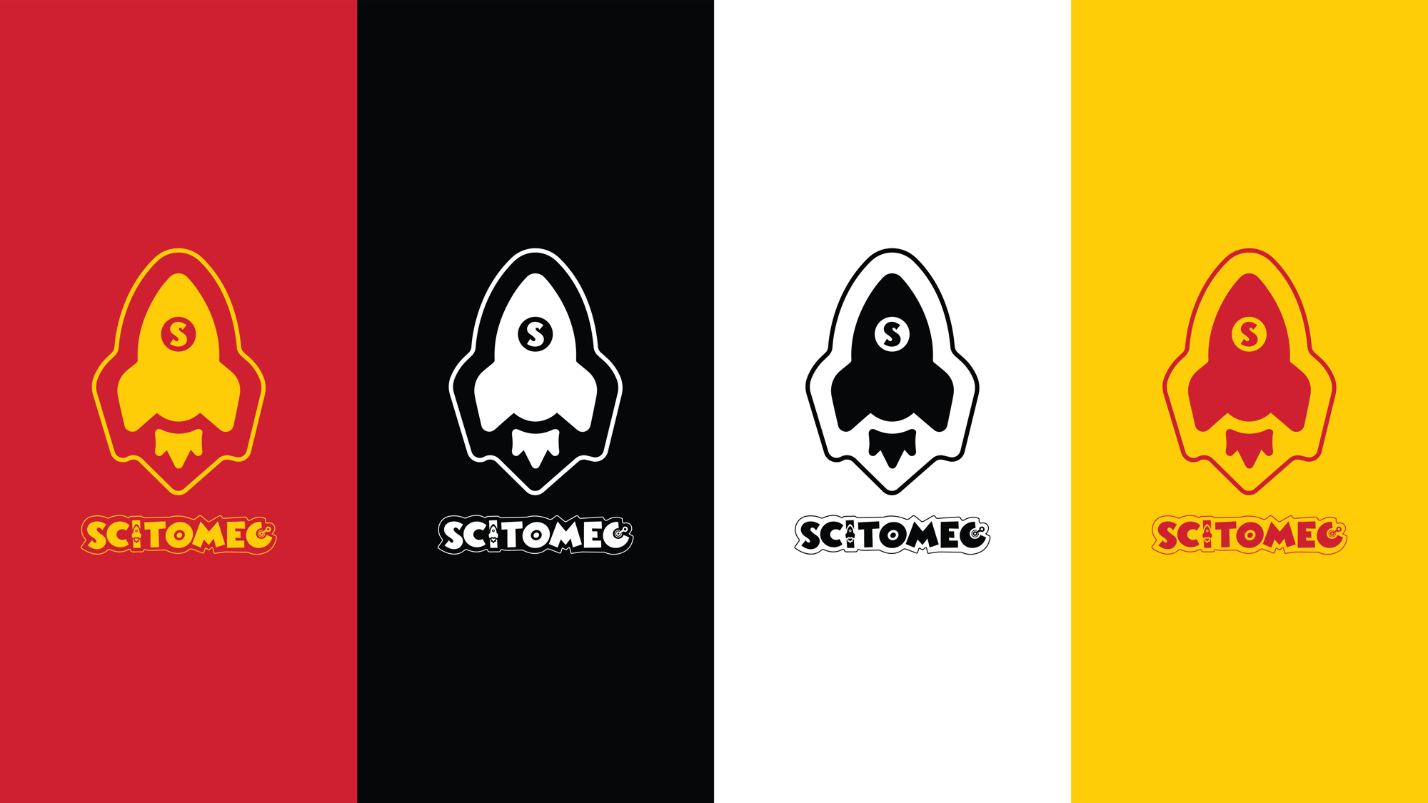
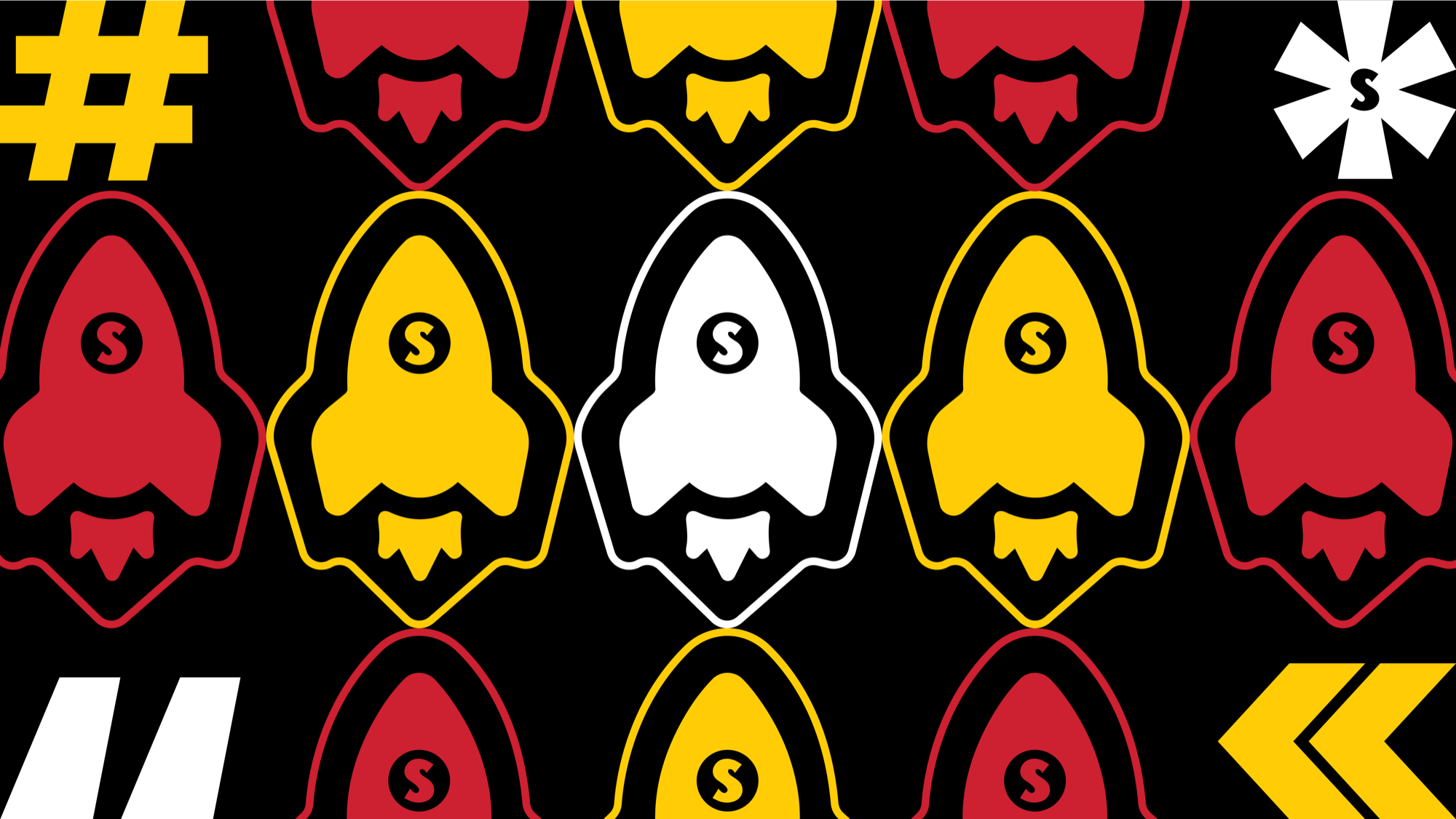
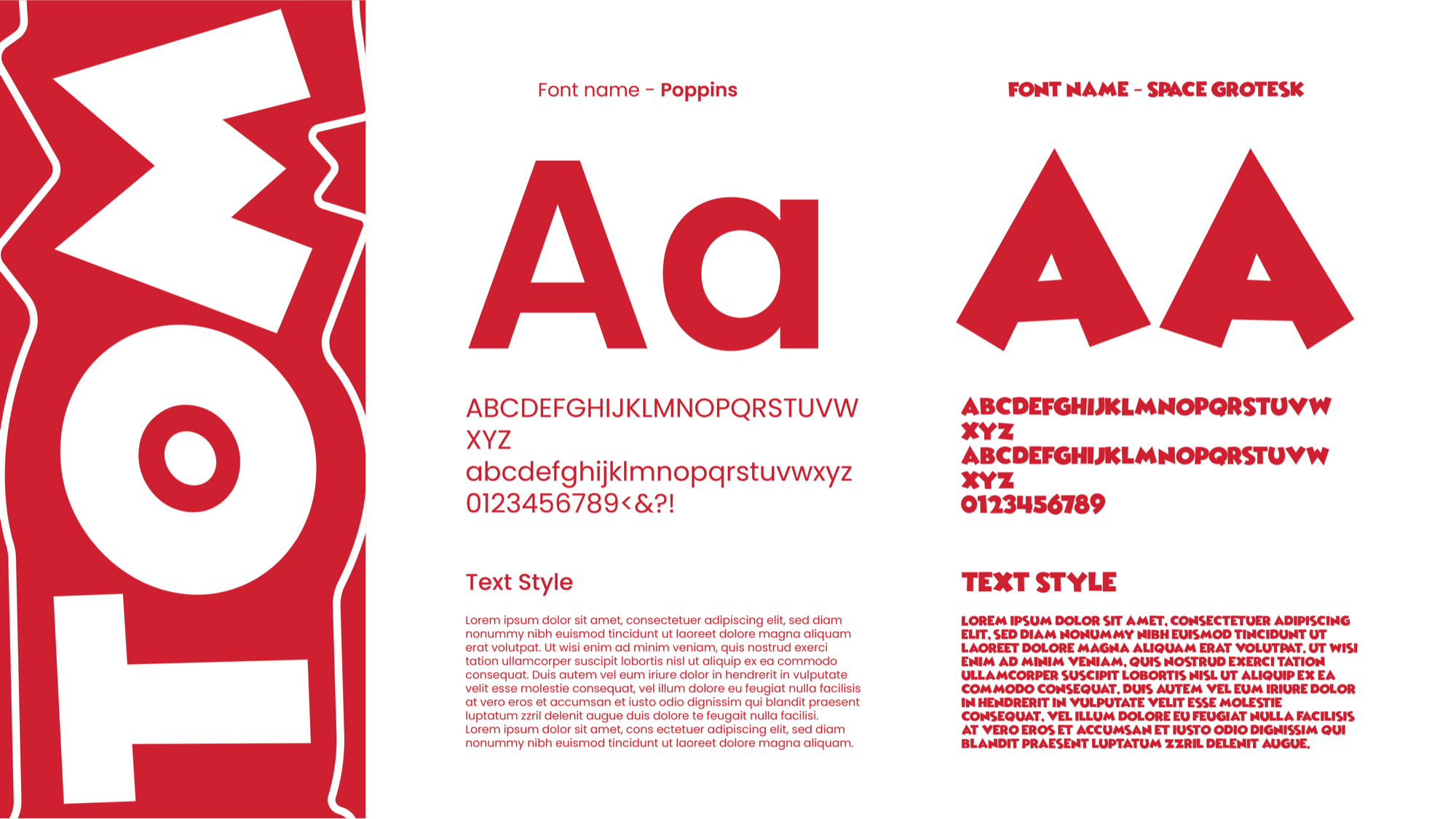
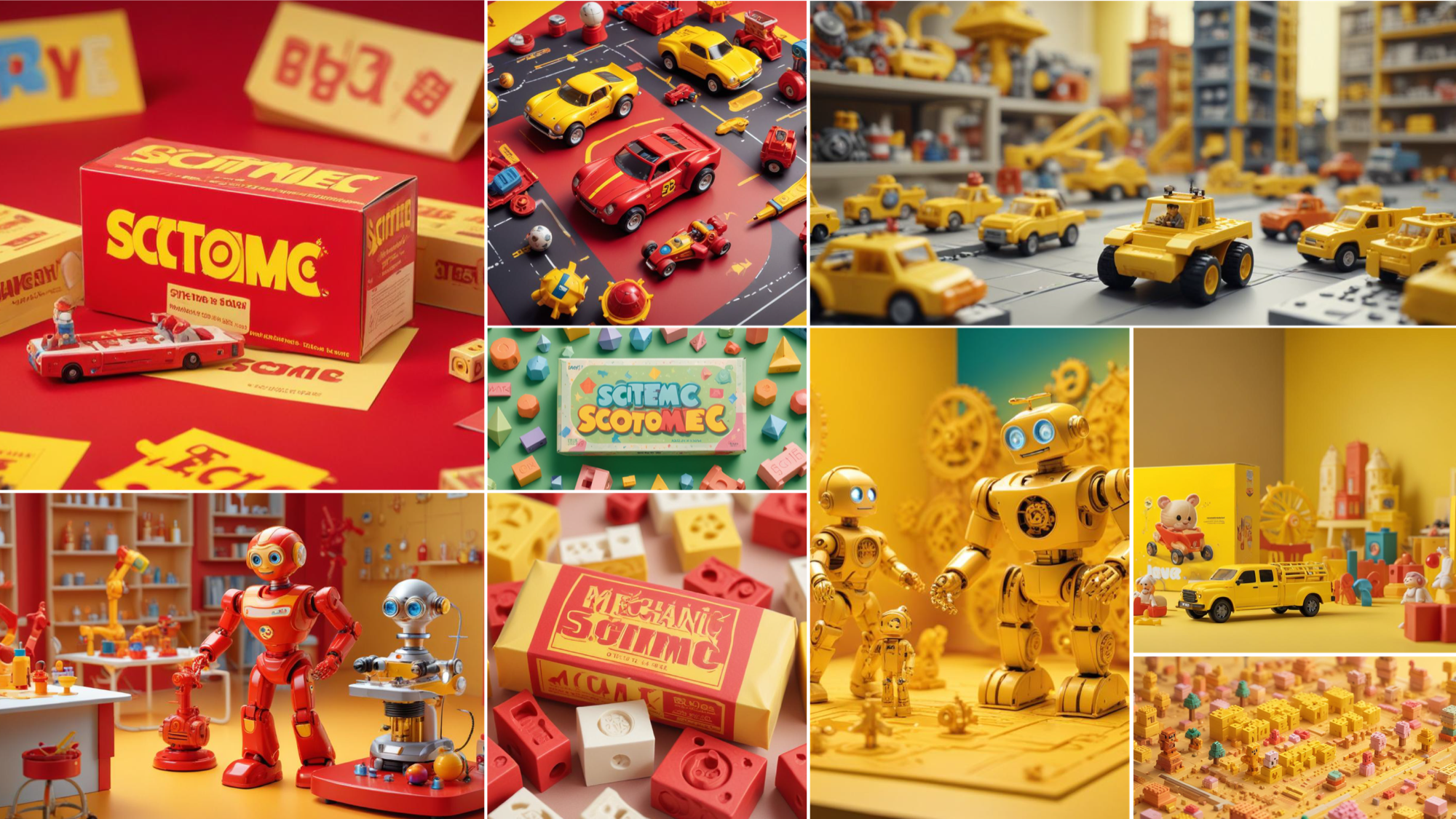
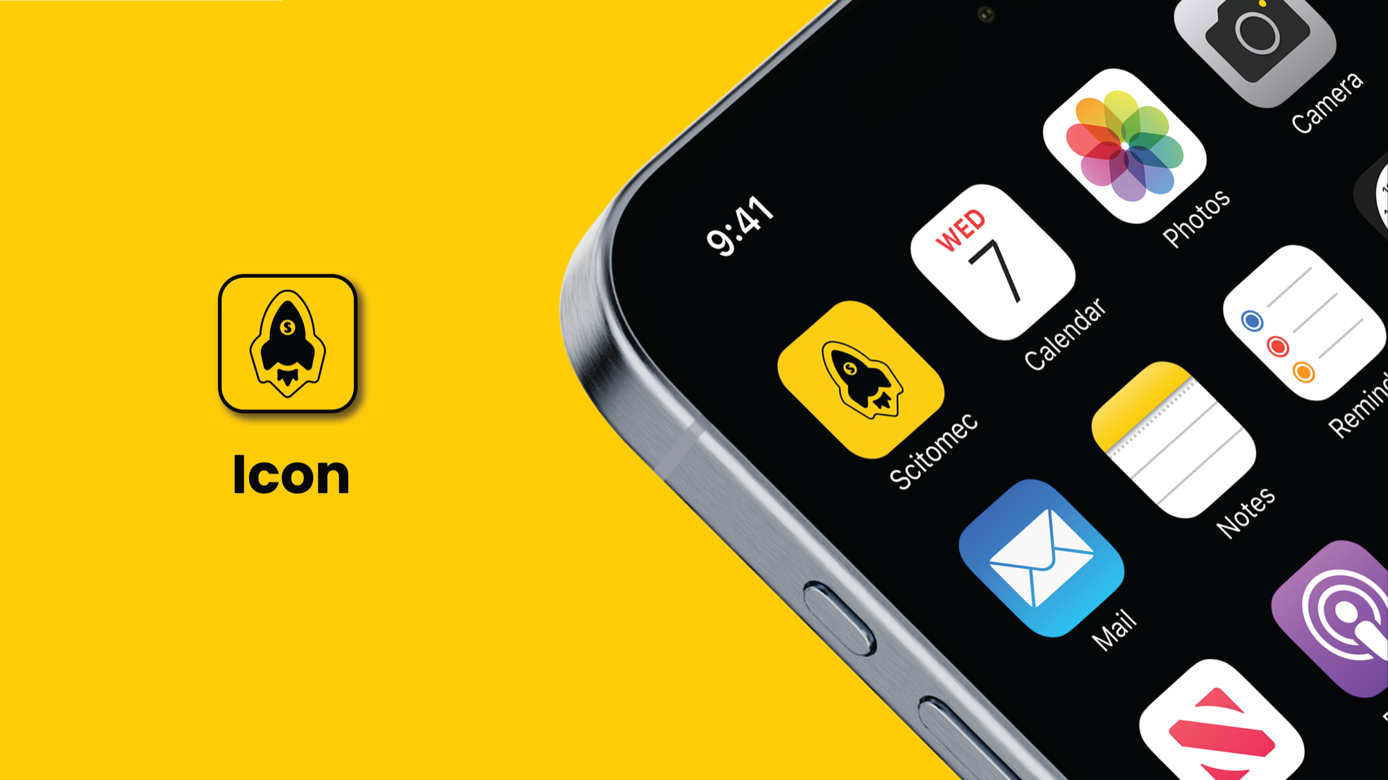
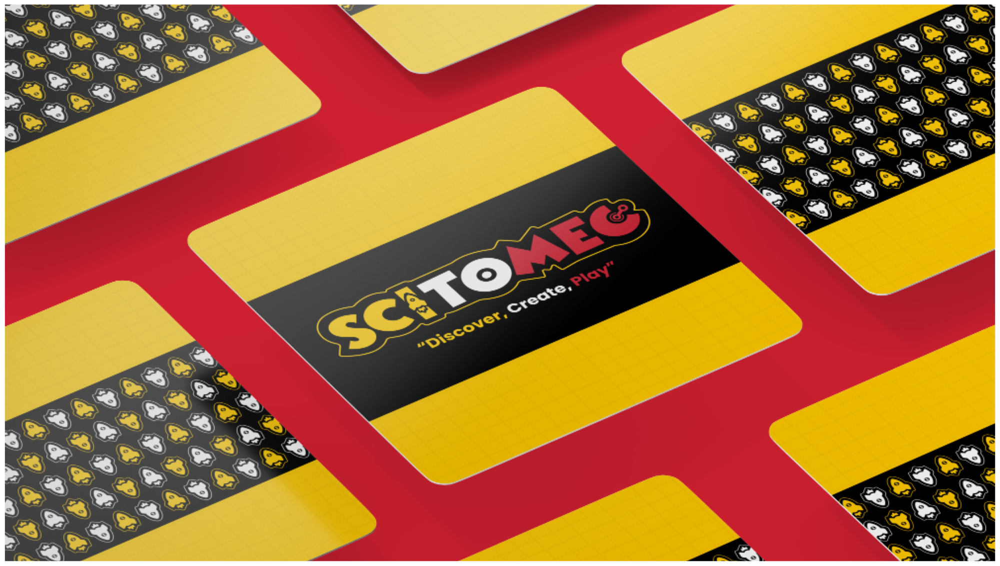
I built the system around a warm tricolor palette of yellow, orange, and red — not chosen at random, but because together they read like a gradient of energy and enthusiasm rather than a scattered burst of primary colors. A custom typographic system gives the brand both structure and personality, flexible enough to move from toy packaging to campaign posters without losing its character. The result is a brand that feels alive — one that matches the energy of the kids it's built for, and gives every parent a clear reason to trust it.
"Discover. Create. Play. Three words. One complete system."
Bold, high-spirited, and intellectually alive — the brand carries the same energy as the children it's built for. Curiosity isn't just the product. It's the design principle.
"Built for the kid who takes things apart just to see how they work."
"Yellow, orange, red — the colours of curiosity on fire."
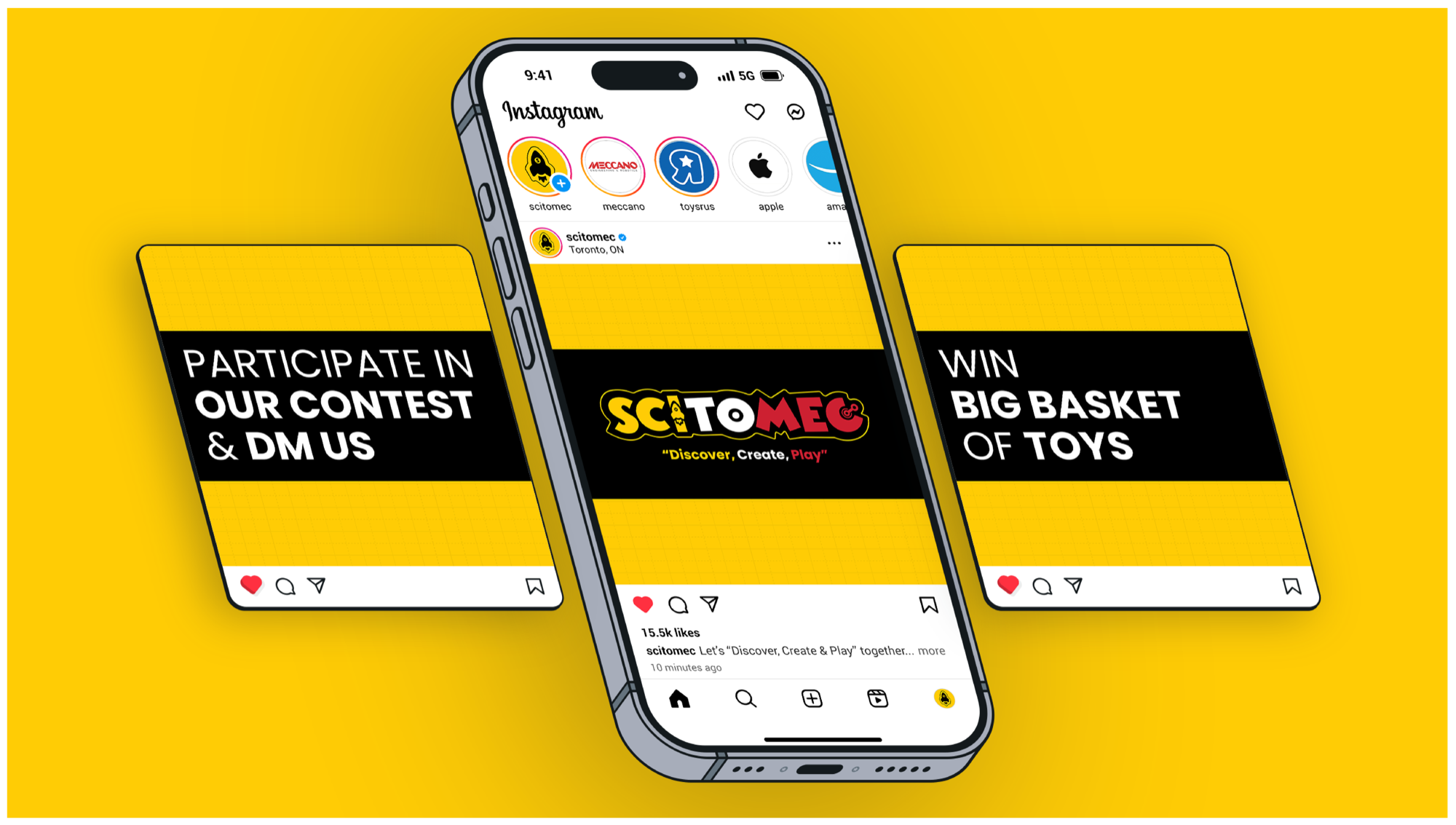
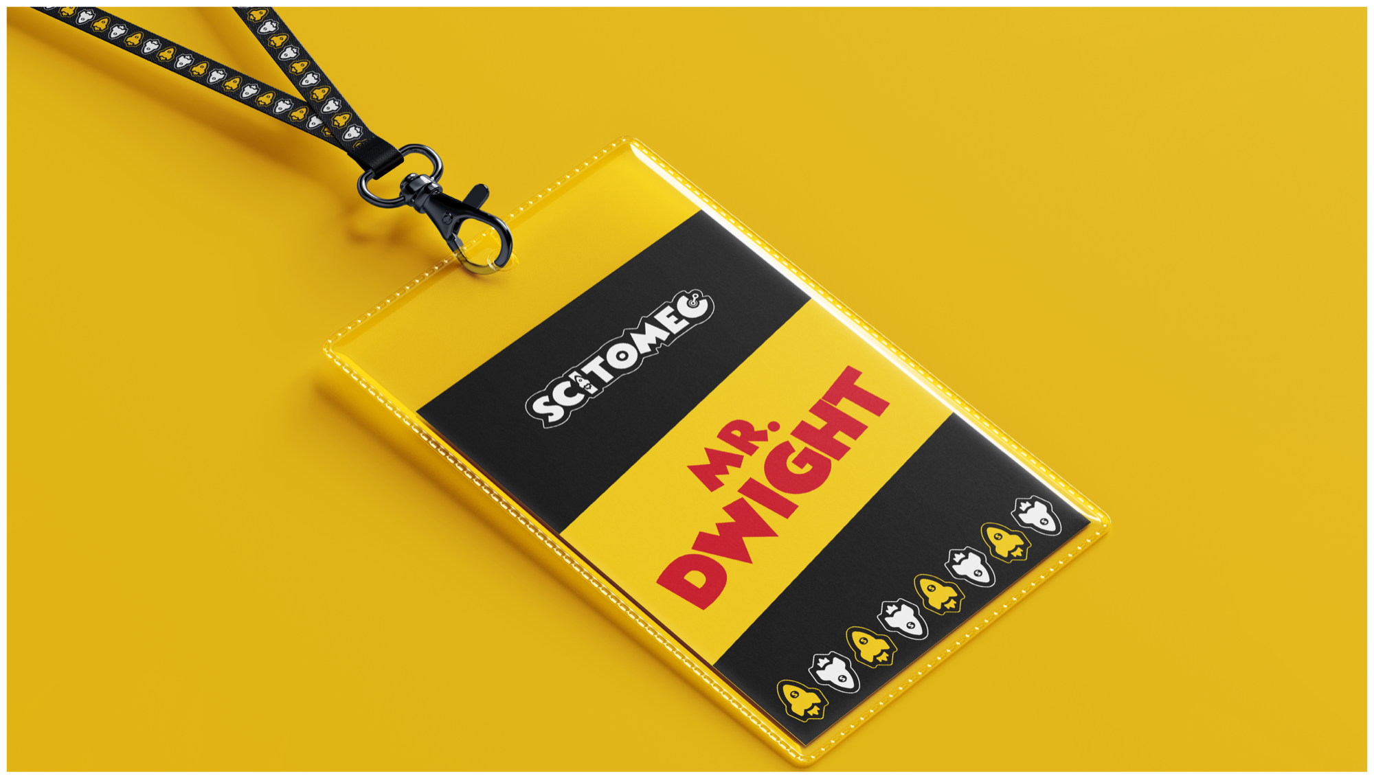
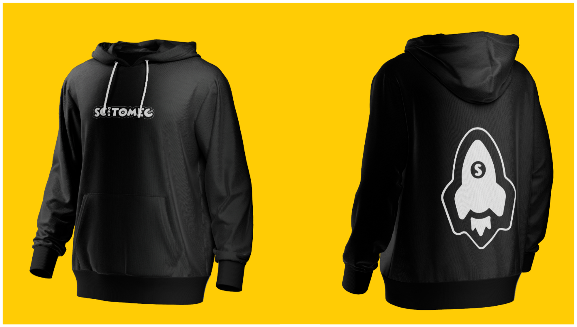
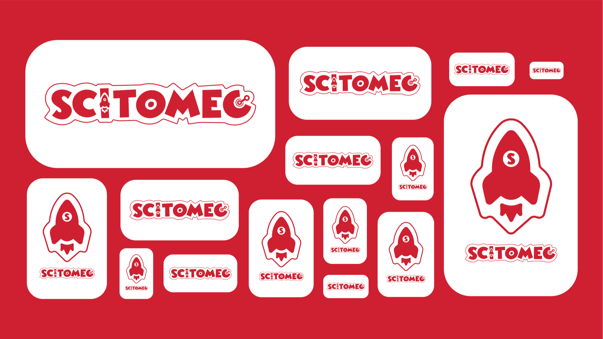
Every touchpoint — from packaging to campaign — carries the same kinetic energy. A system that scales from toy box to billboard without losing a single bit of what makes it feel alive.