
Doon
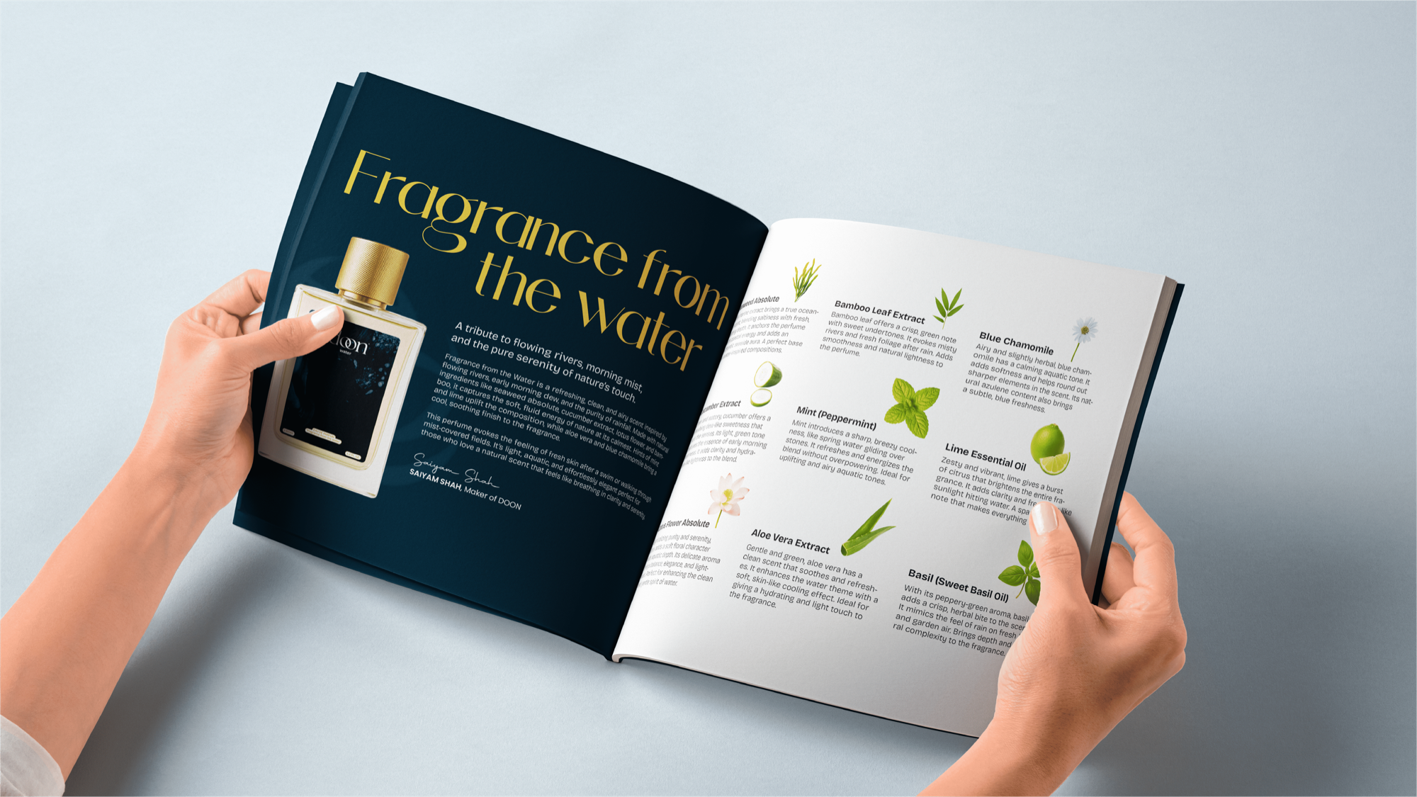
Brand IdentityDoon started with a name and almost nothing else. No visual direction, no existing identity — just the idea of a fragrance brand rooted in something real. I was drawn to it because I wanted to explore what luxury looks like when it stops trying so hard. Most fragrance brands treat exclusivity like a trophy they need to keep showing you. Doon was supposed to be the opposite — the kind of brand you notice because it belongs in the room, not because it's announcing itself. I built this one entirely from instinct, chasing the feeling of something uncovered rather than designed.
The hardest part was figuring out what "natural luxury" actually looks like — because that phrase gets used for everything. Half the fragrance industry claims it, and half of those brands still feel polished in a way that's disconnected from anything real. I didn't want Doon to look like every other clean beauty or wellness brand hiding behind a beige palette and minimal type. It needed to feel genuinely grounded — soil and stone, not a spa brochure. Getting that balance right between raw and refined, earthy and premium, took a lot of wrong turns before I landed somewhere I actually believed.
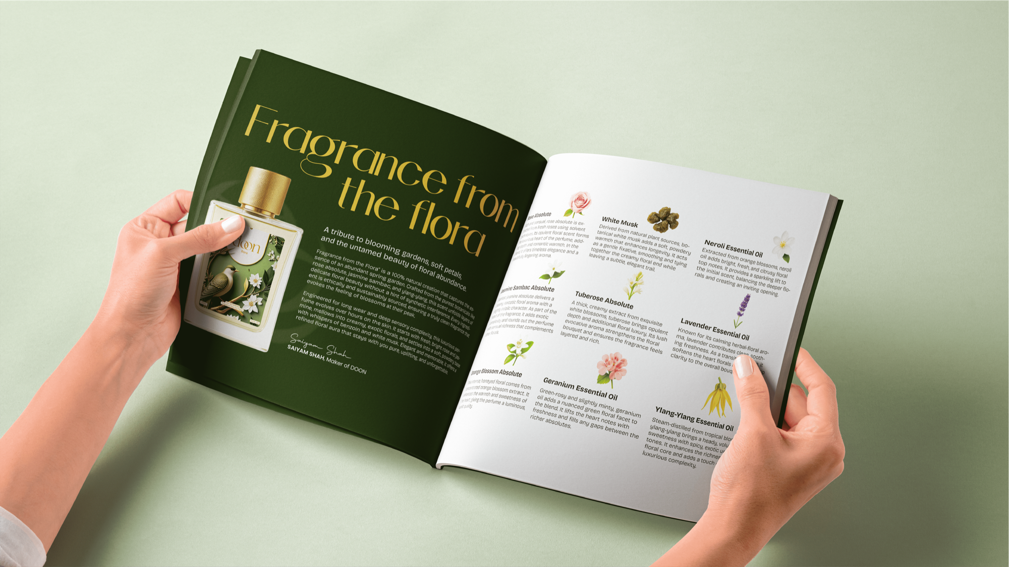
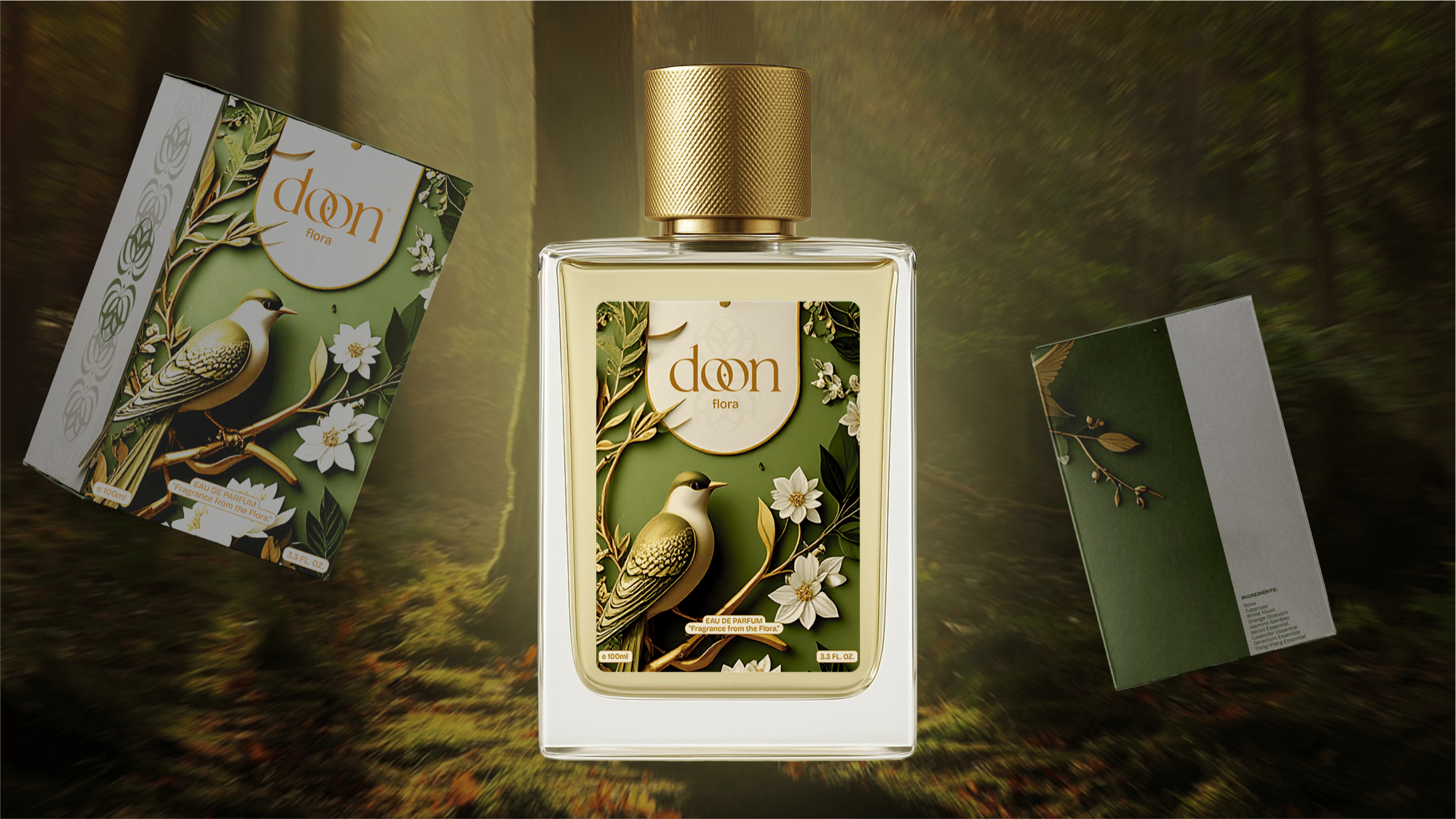
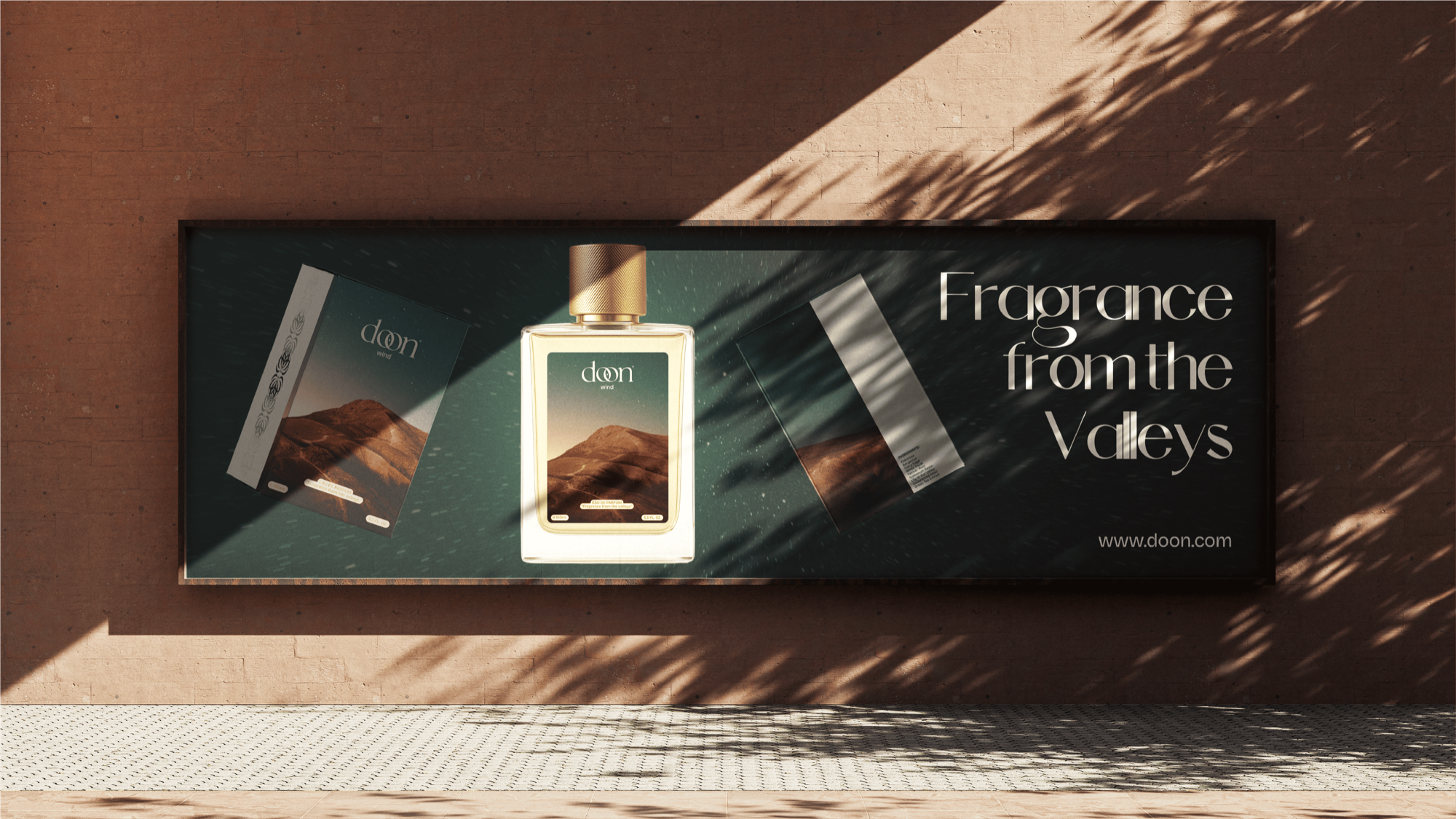
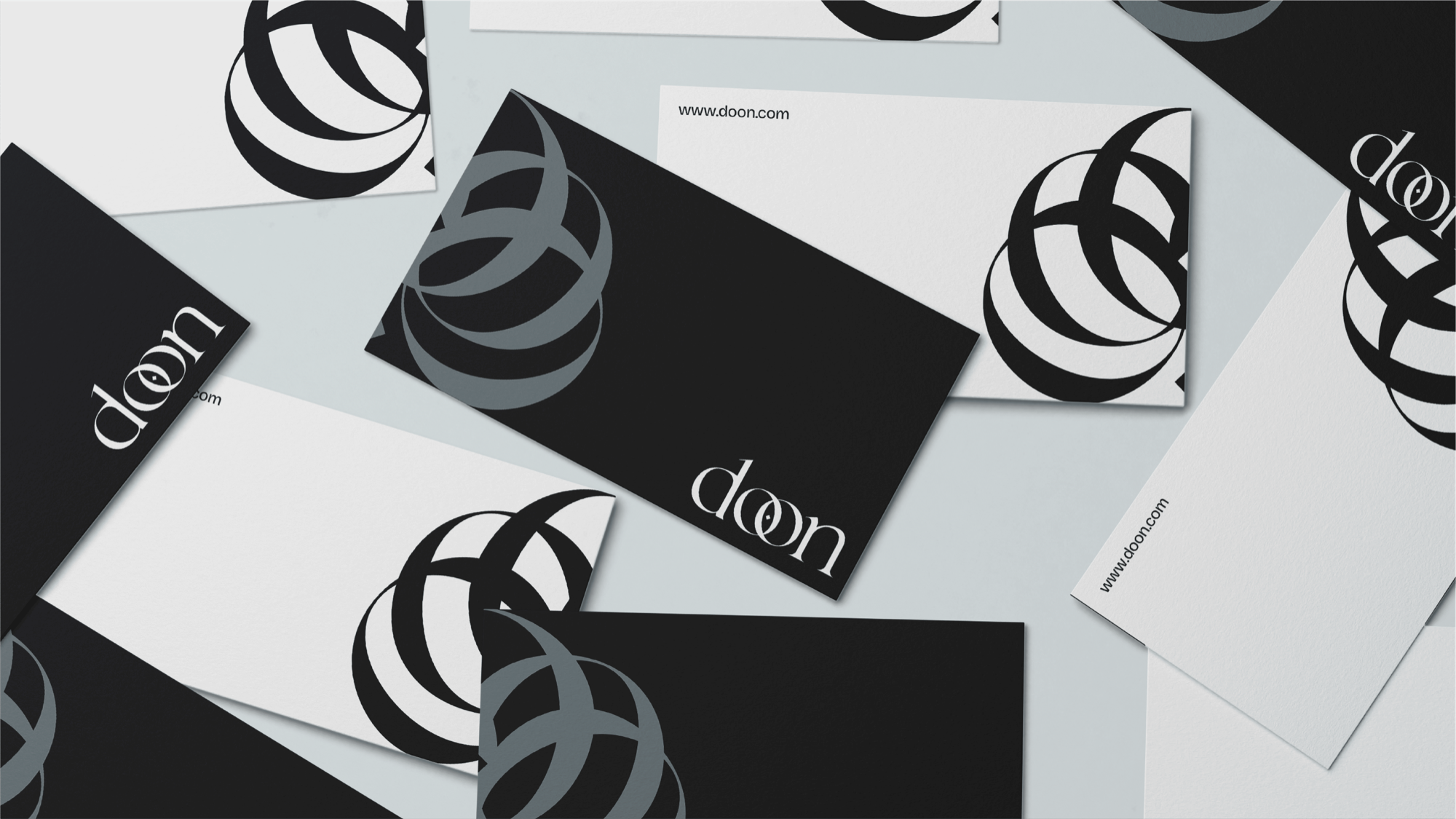
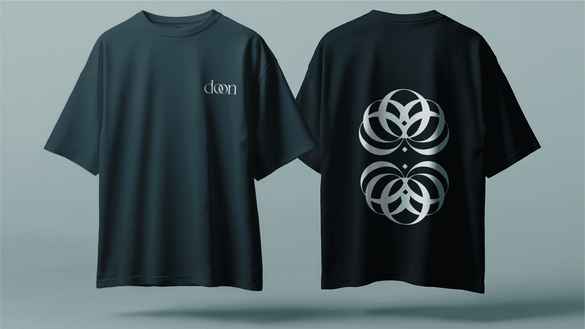
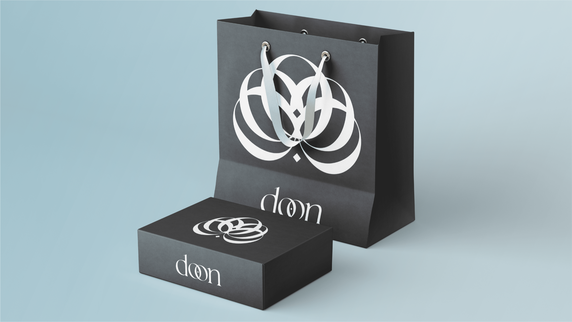
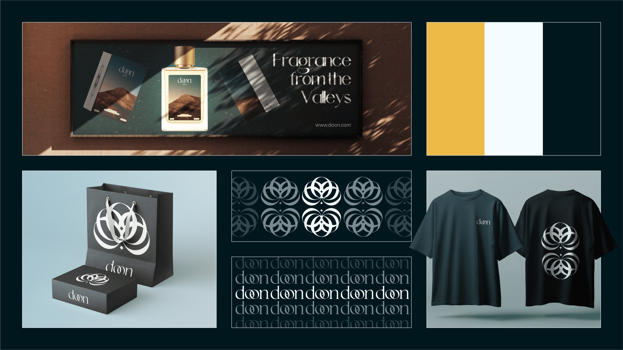
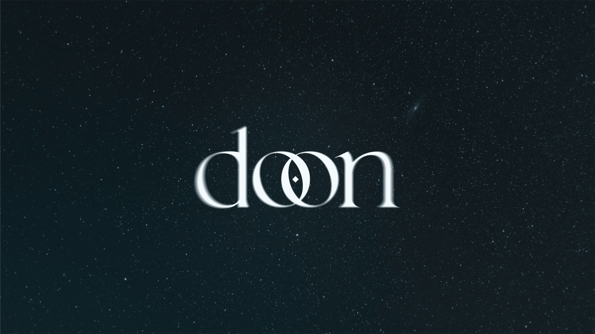
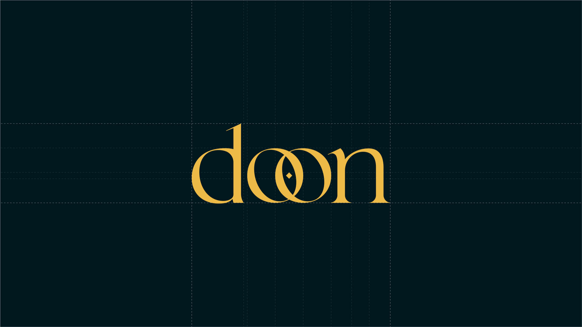
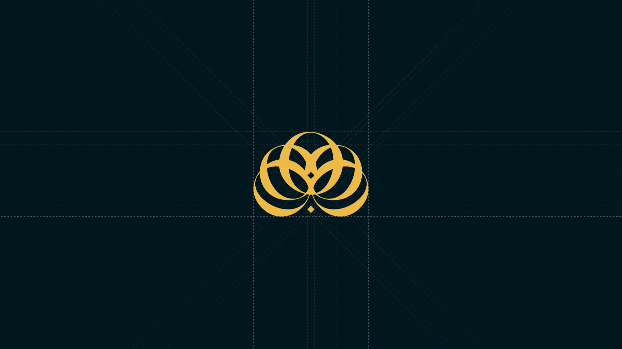
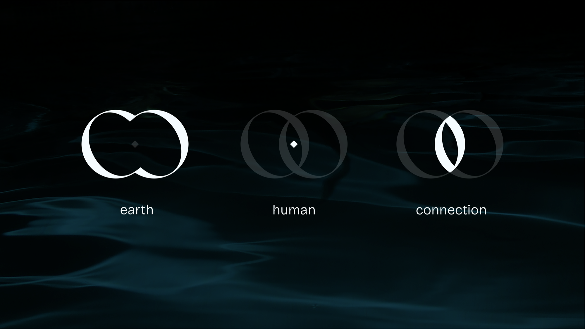
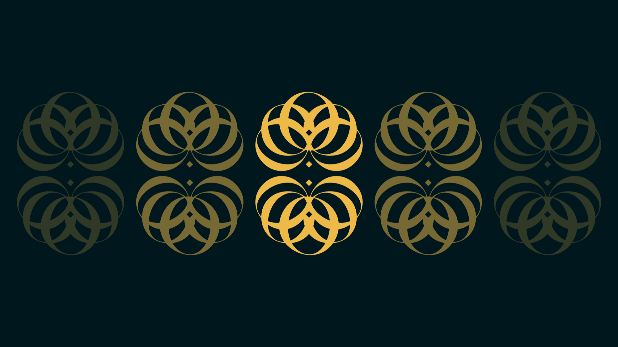
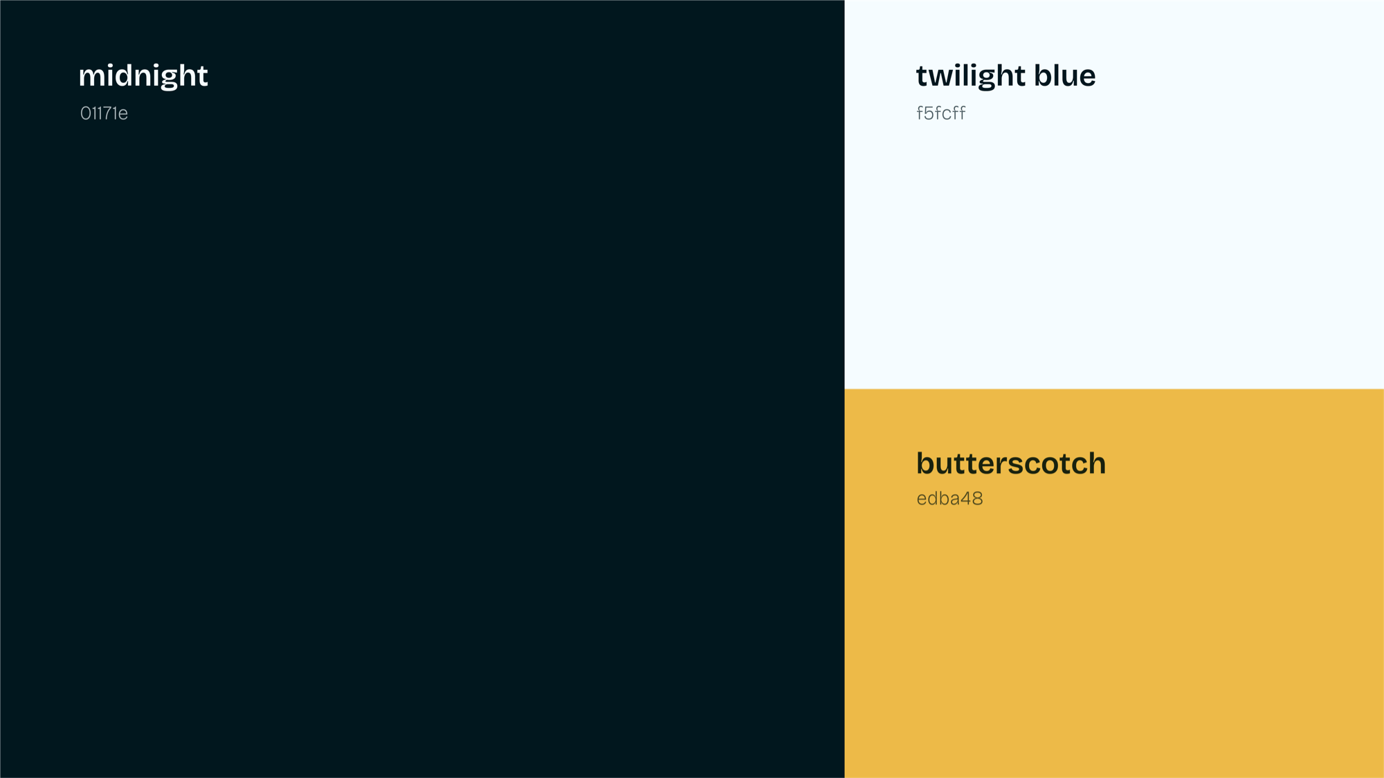
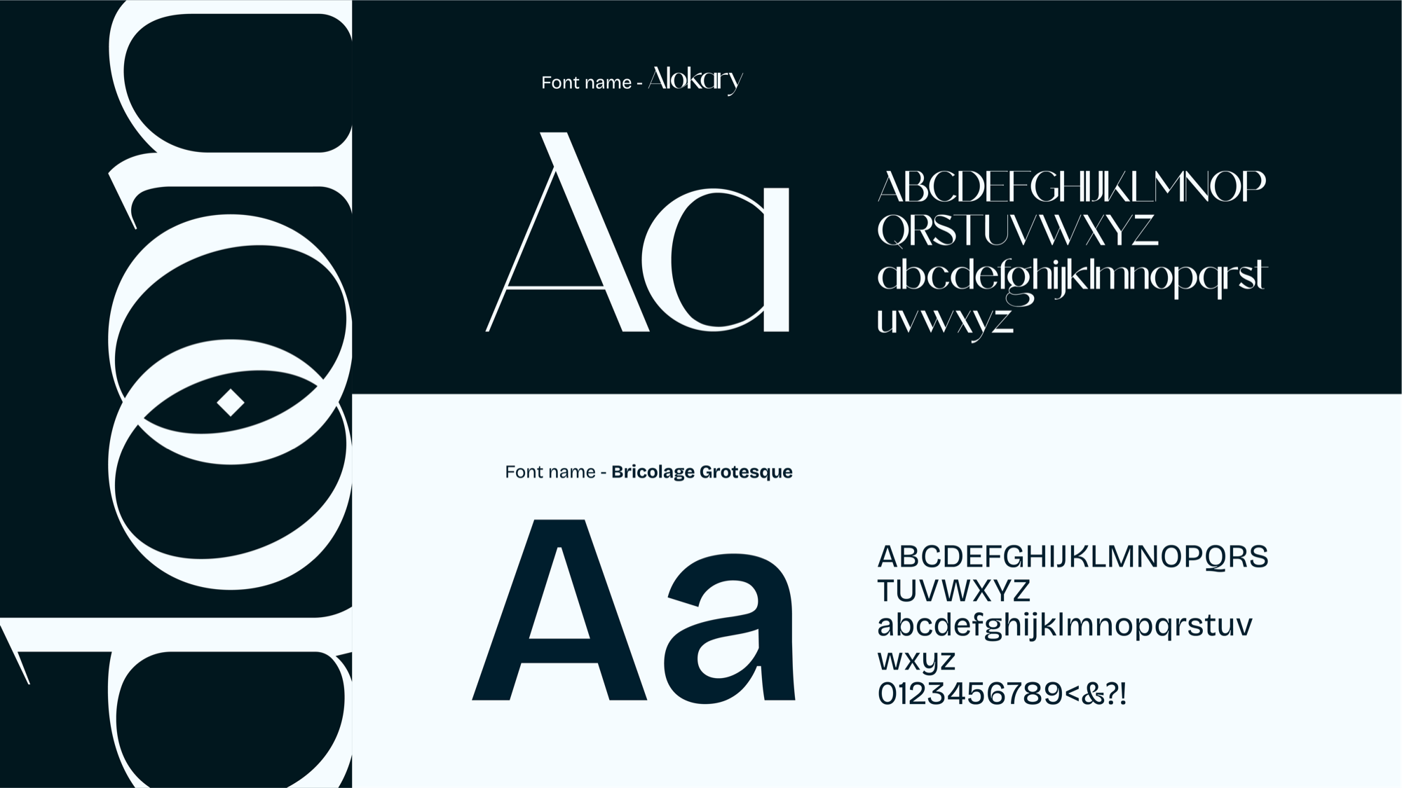
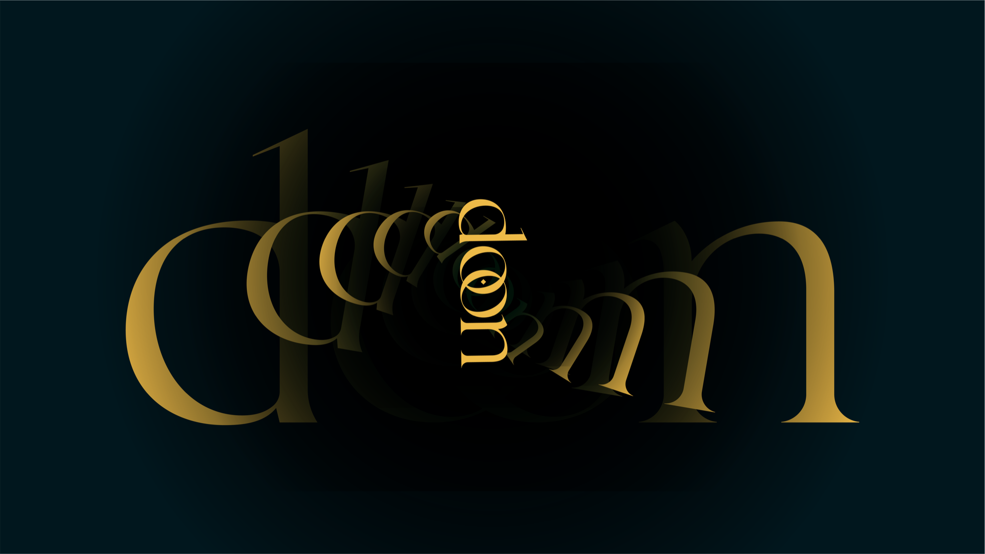
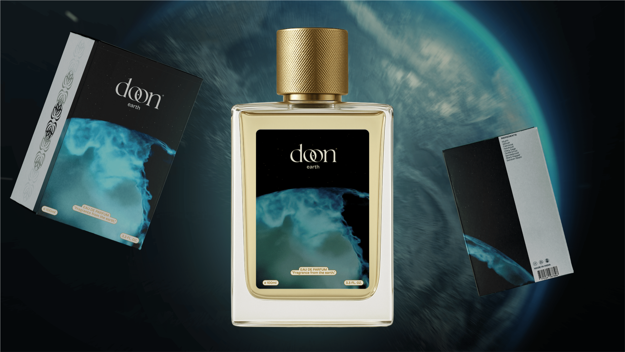
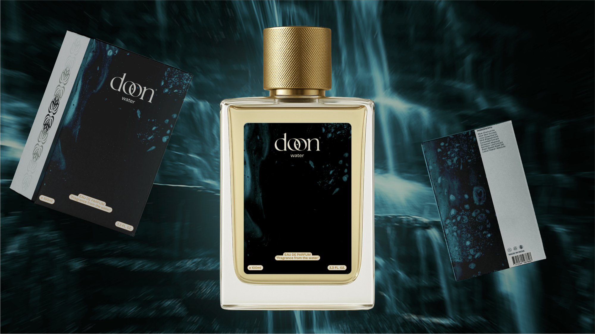
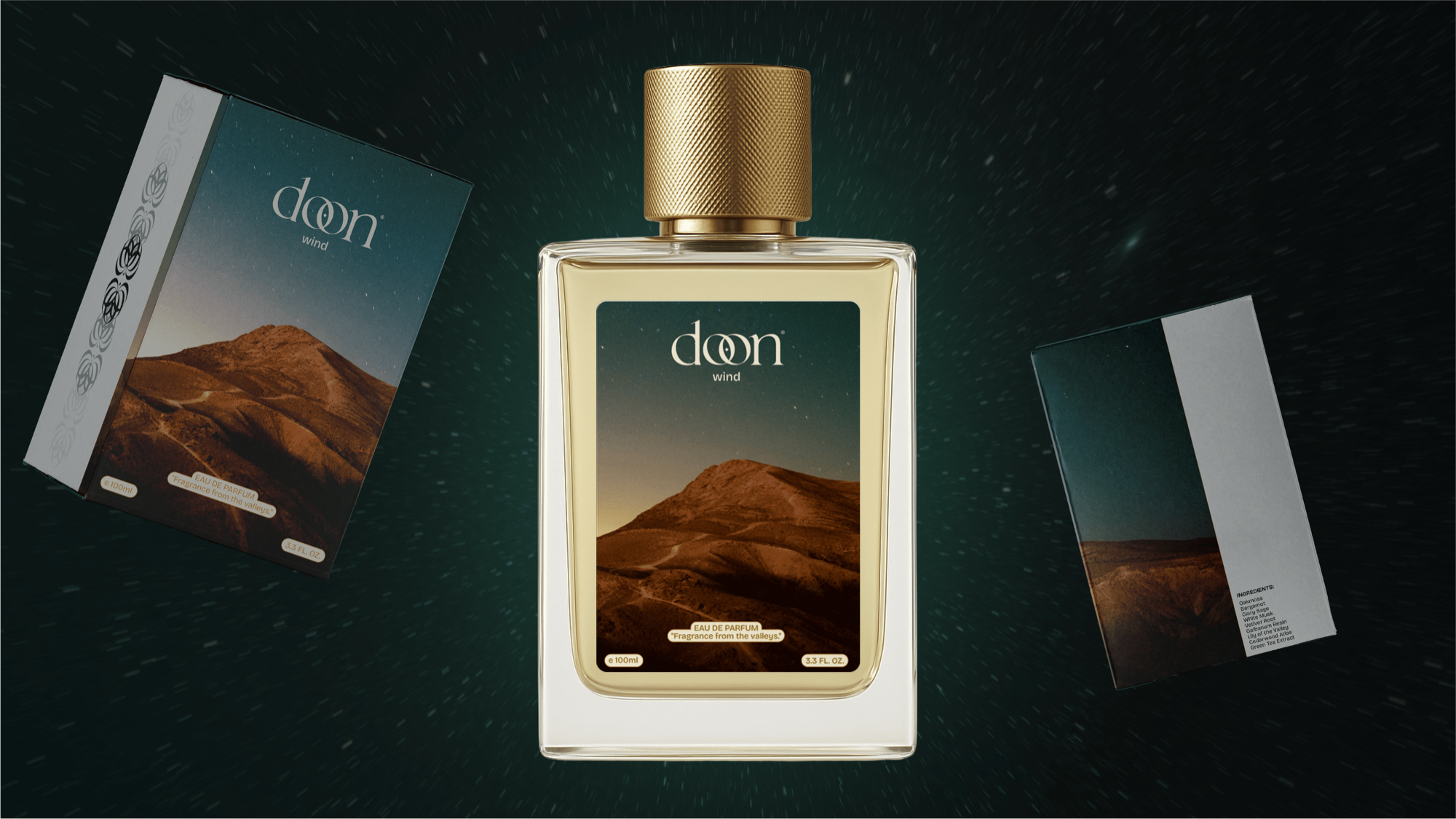
I built the identity around the teardrop — a single drop of essential oil caught mid-fall — embedded quietly into the wordmark rather than turned into a logo device. The typography draws from organic serif forms that have weight without being heavy. The palette came from mountain valleys at dusk: deep, atmospheric, still. Everything was designed to work together as a whisper, not a shout — the kind of identity that rewards attention without demanding it. A brand that feels like it's always existed.
"Built on purity, not pretense."
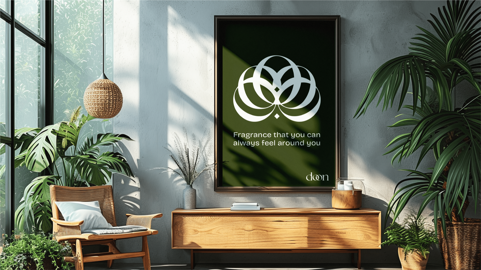
The teardrop lives in the letterform — easy to miss, impossible to forget once you see it. A single drop of essential oil, caught mid-fall, embedded in the wordmark.

"Earth-rooted. Atmosphere-driven. Quietly irreducible."
"A brand that doesn't announce itself. You just notice it's there."
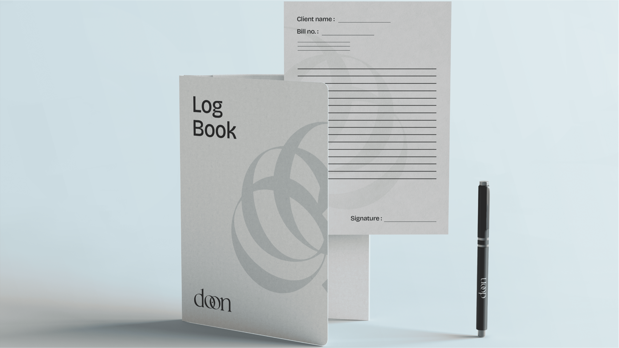
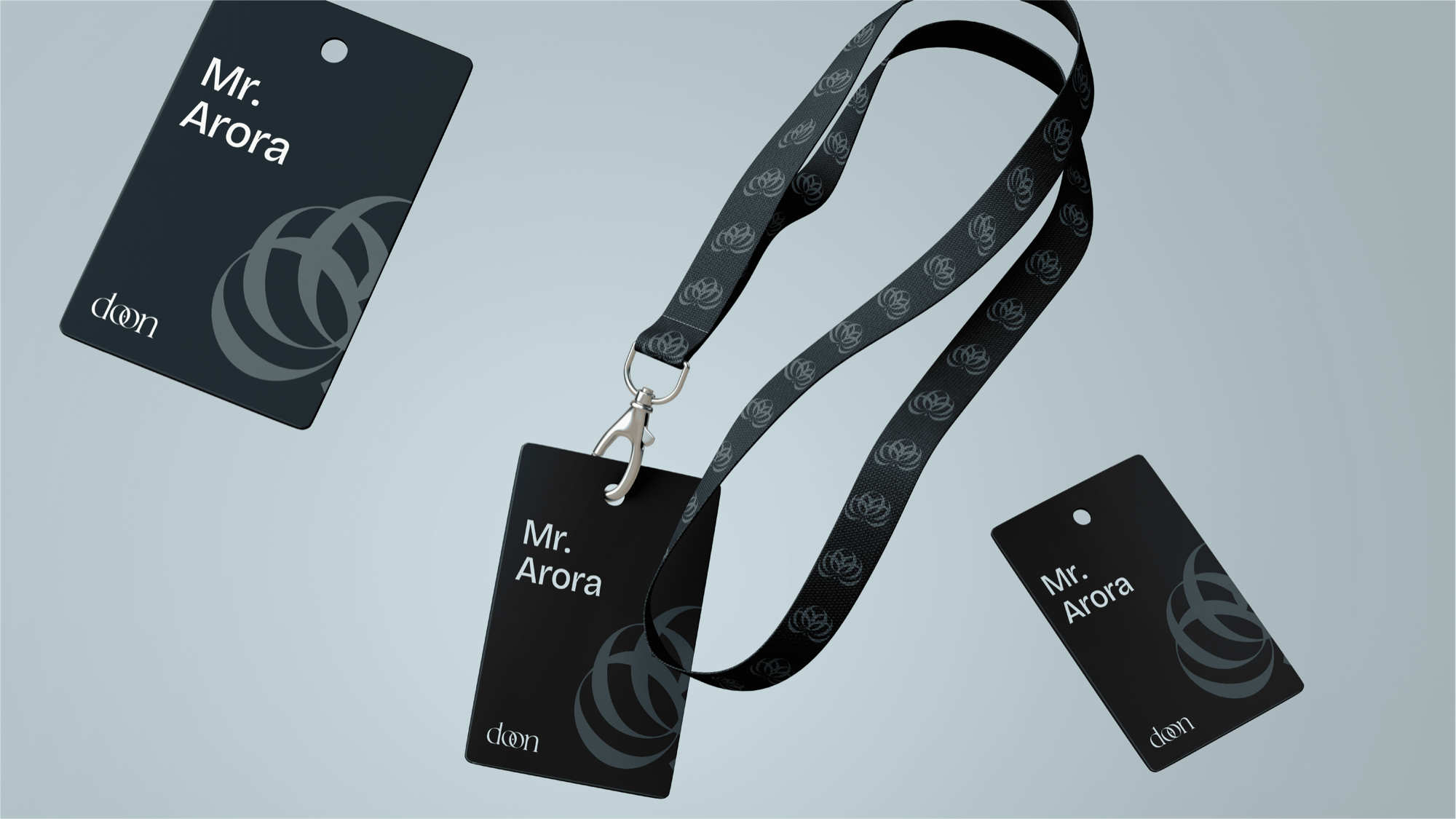
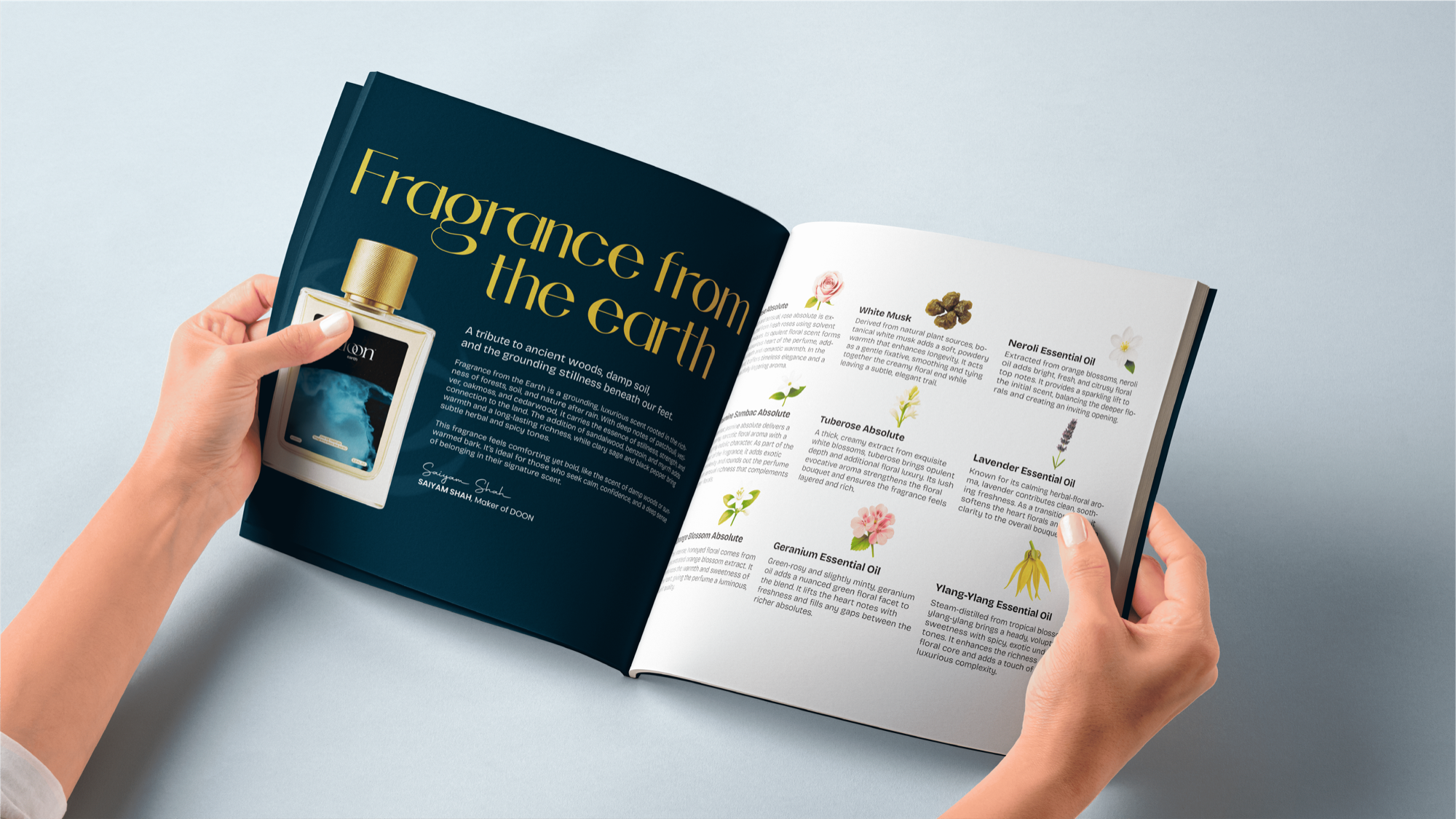
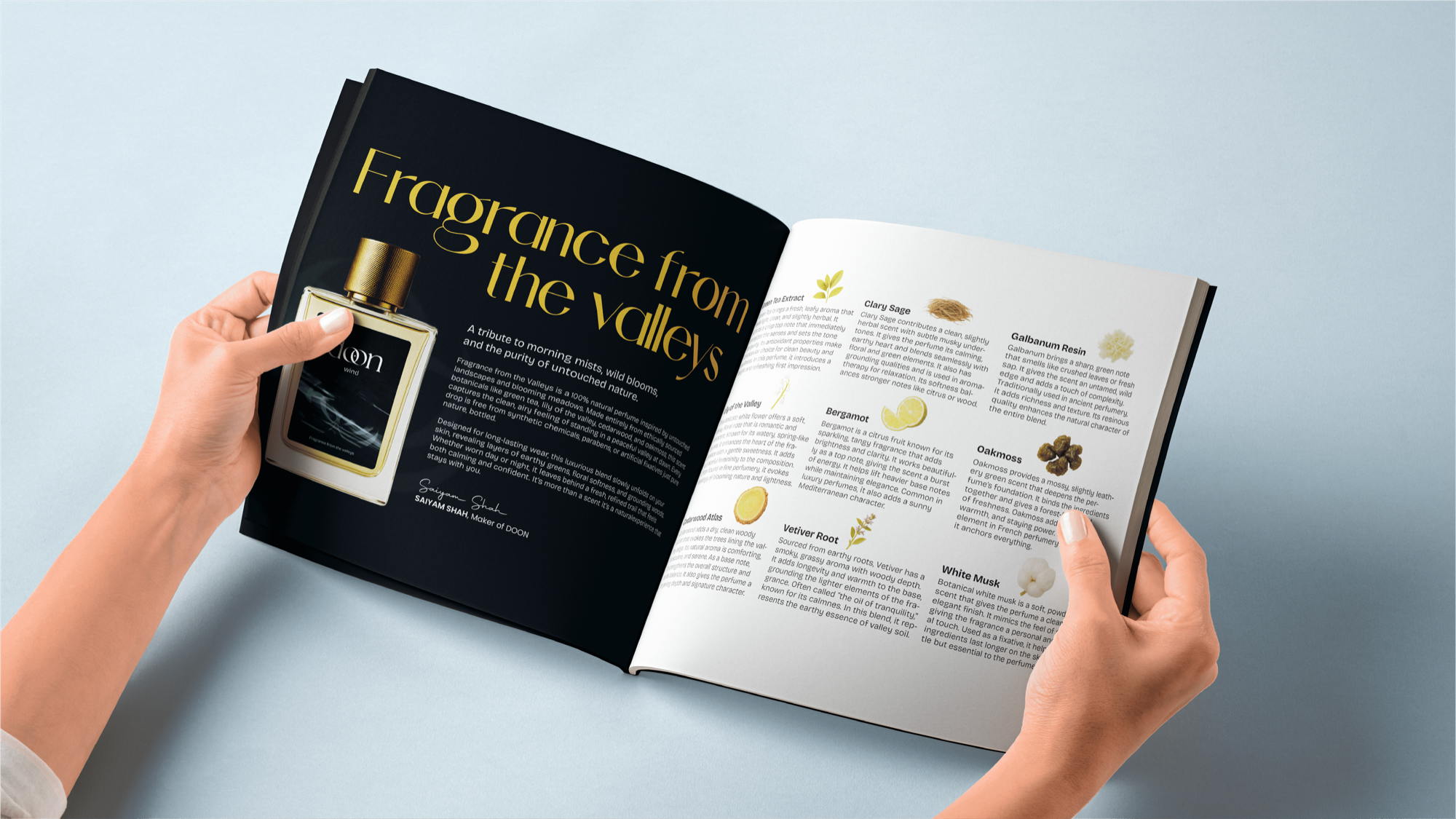
Every touchpoint — from label to lookbook — carries the same quiet authority. Nothing decorative, nothing wasted. The kind of identity that rewards attention without demanding it.