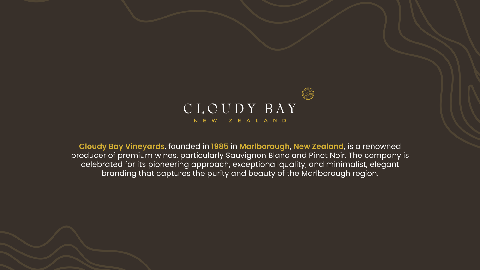
Cloudy Bay
Packaging DesignI picked up a bottle of Cloudy Bay Sauvignon Blanc and spent a long moment staring at the label. This is one of the most celebrated wines out of New Zealand — a Marlborough benchmark that's been served in restaurants across the world for decades — and the packaging just didn't match what was inside. The wine had serious reputation behind it and the label felt like an afterthought. Nobody commissioned this project. Cloudy Bay doesn't even know I did it. I just thought the bottle deserved better, so I opened my sketchbook and started working.
Cloudy Bay already had name recognition — the brand sells itself to anyone who knows wine. That's both an advantage and a real constraint, because I couldn't strip everything away or make it unrecognizable. It needed a full redesign that still felt inevitable, like it had always been the right answer. Wine packaging adds another layer of difficulty: it's a category full of illustrated labels, ornate crests, and heritage-heavy design, and going minimal in that space is a risk. A lot of people equate visual complexity with quality, which is exactly the wrong instinct — and exactly what I wanted to push back against.
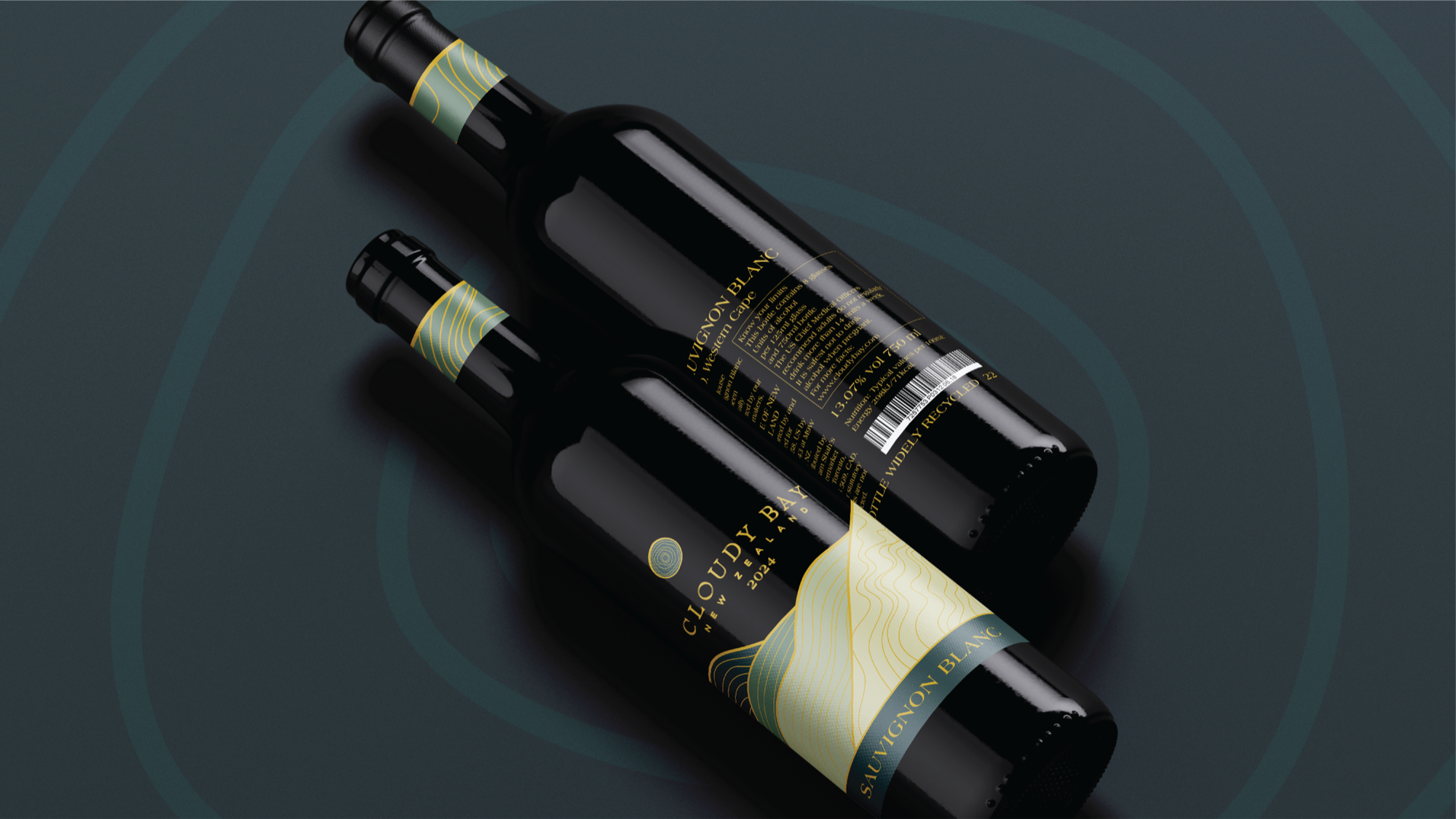
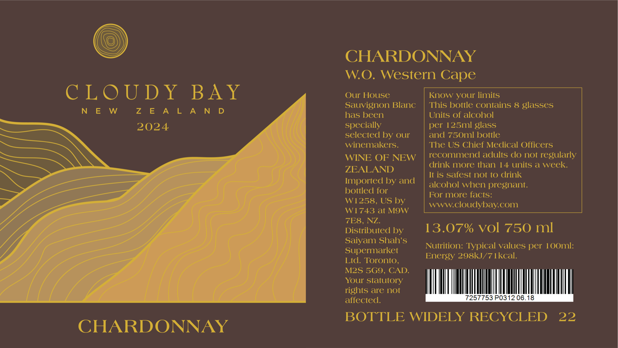
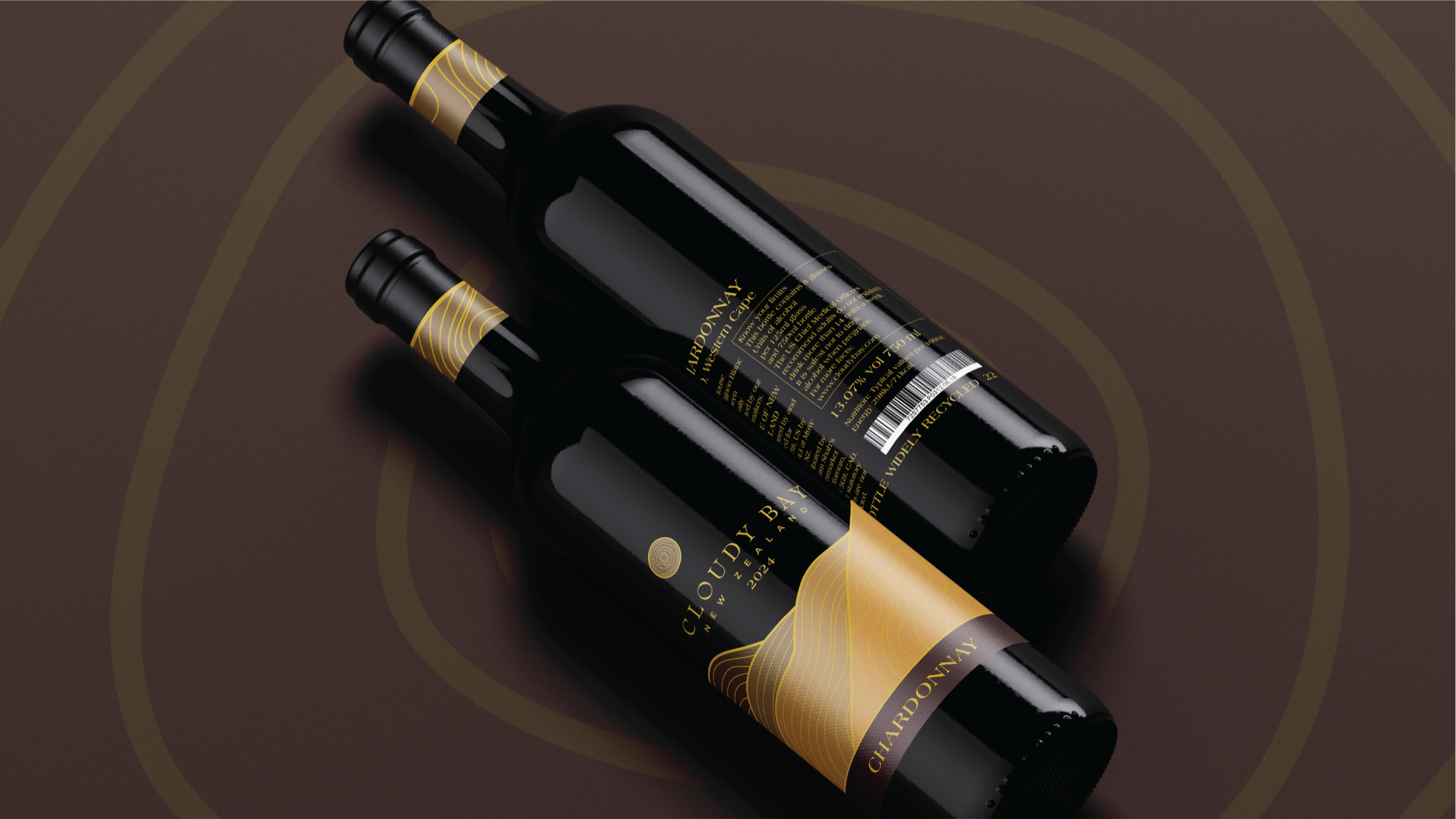
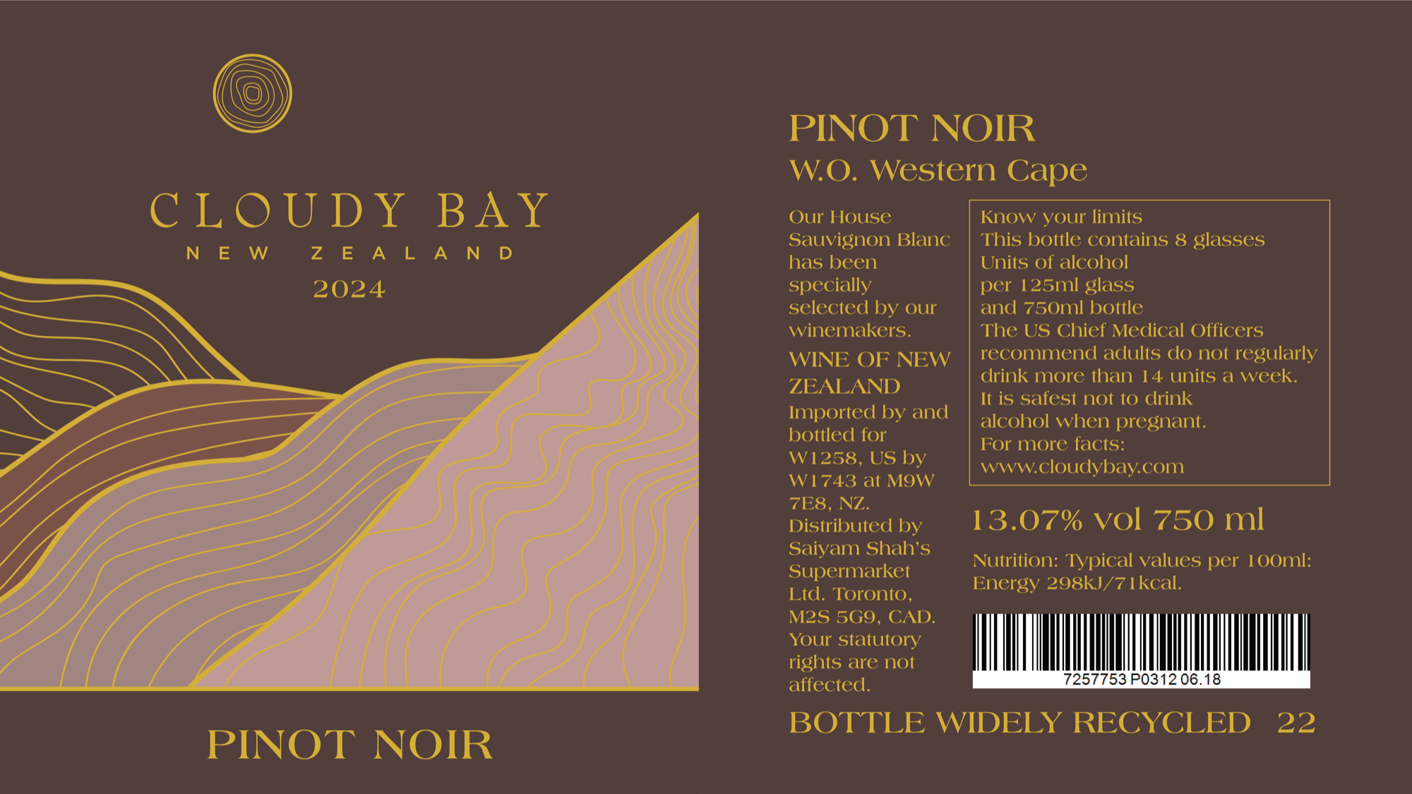
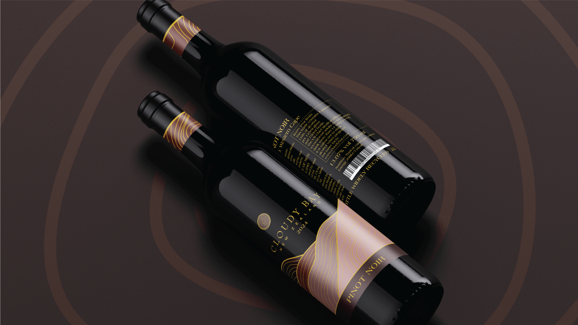
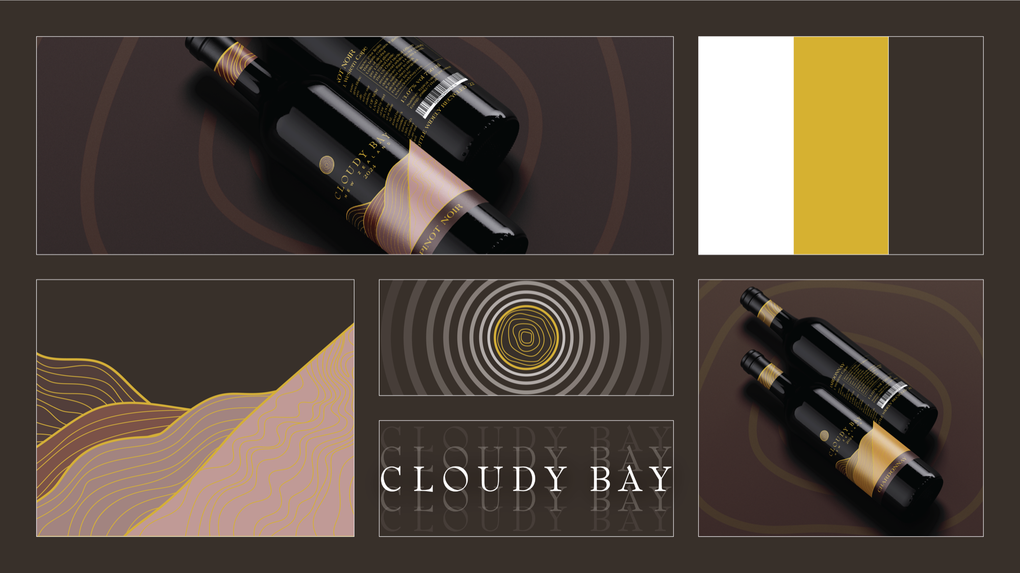
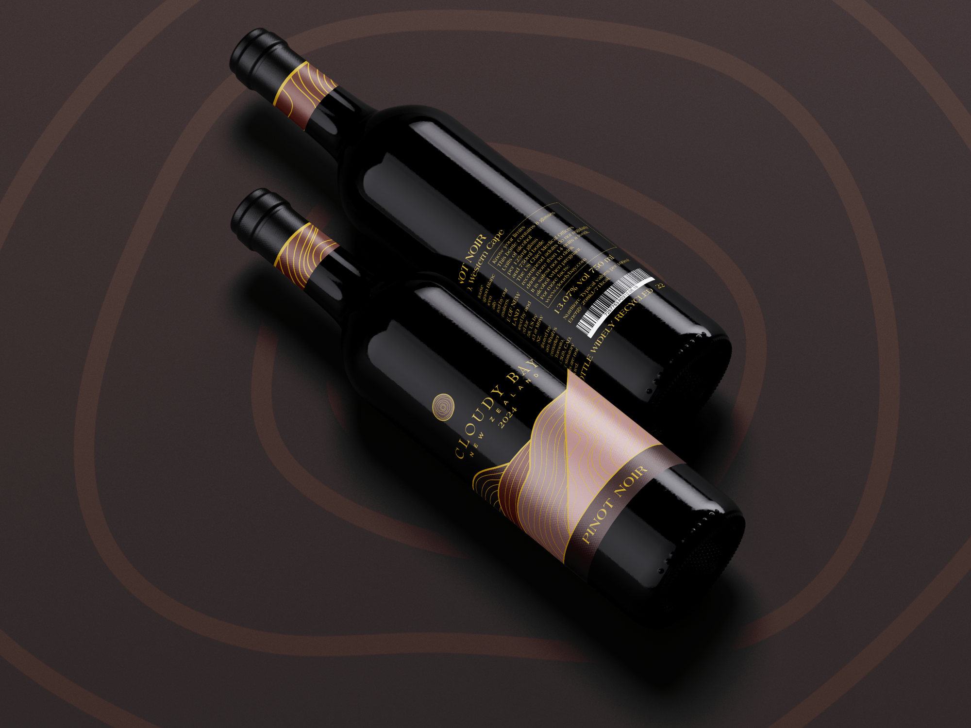
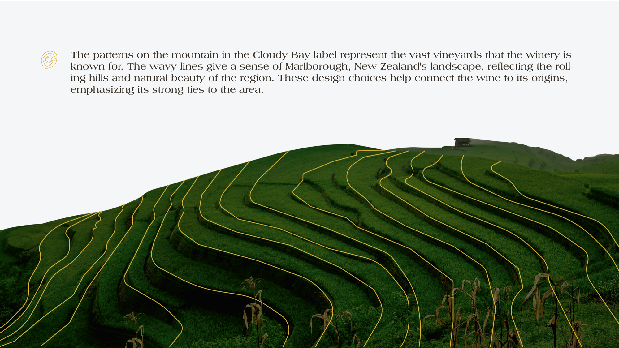
I took the topographic ridgelines of the Marlborough valley — the landscape that makes Cloudy Bay what it is — and rendered them in rich gold against a near-black ground. The label references the land without illustrating it. Typography is deliberately restrained: the name commands the space, everything else steps back and lets it. There's no decoration that isn't earning its place. The result is a label that holds its own next to anything else on the shelf while still feeling like it belongs in a Michelin-starred restaurant. The wine does the talking. The label finally frames it properly.
"The label should never work harder than the wine."
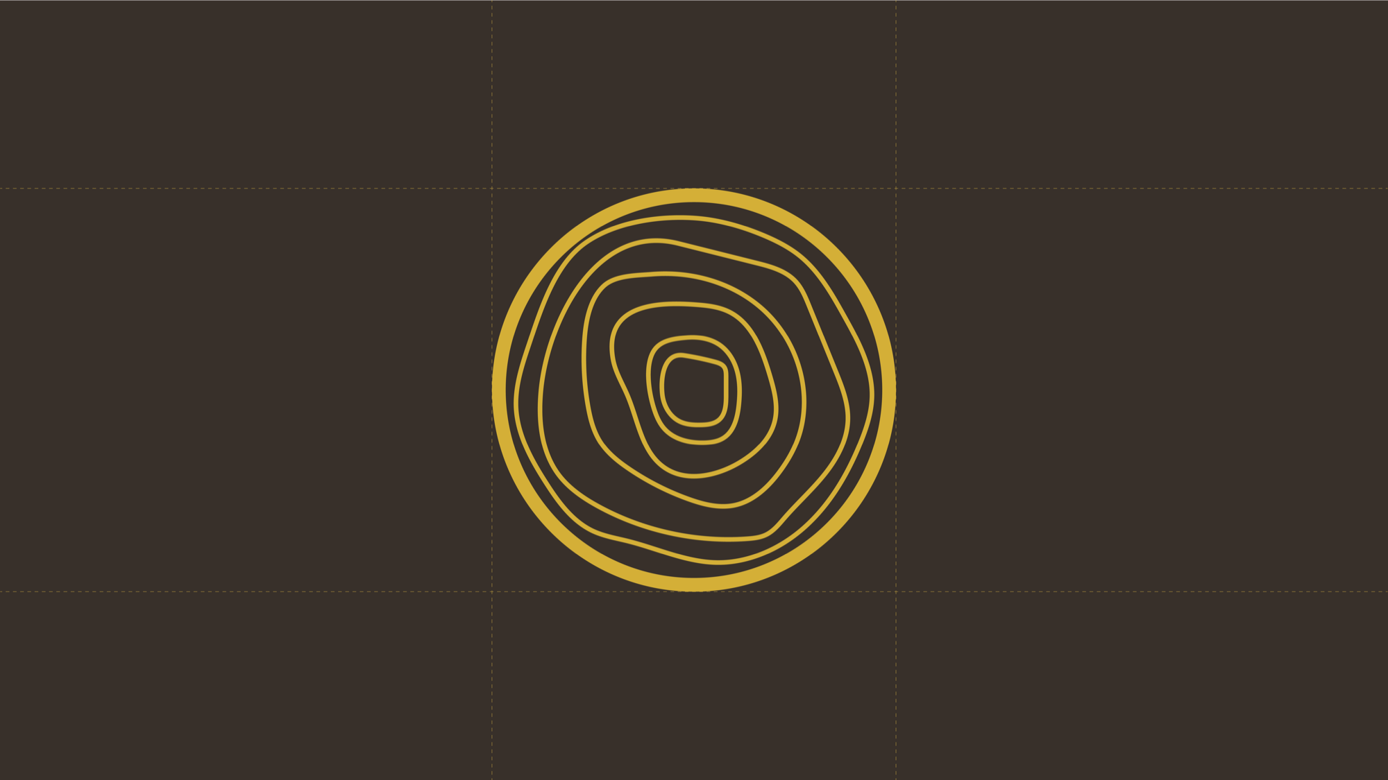
Rich gold against near-black — the topographic ridgelines of Marlborough rendered as a mark of origin, craft, and quiet authority.

"Restrained. Luxurious. Worthy of what's inside."


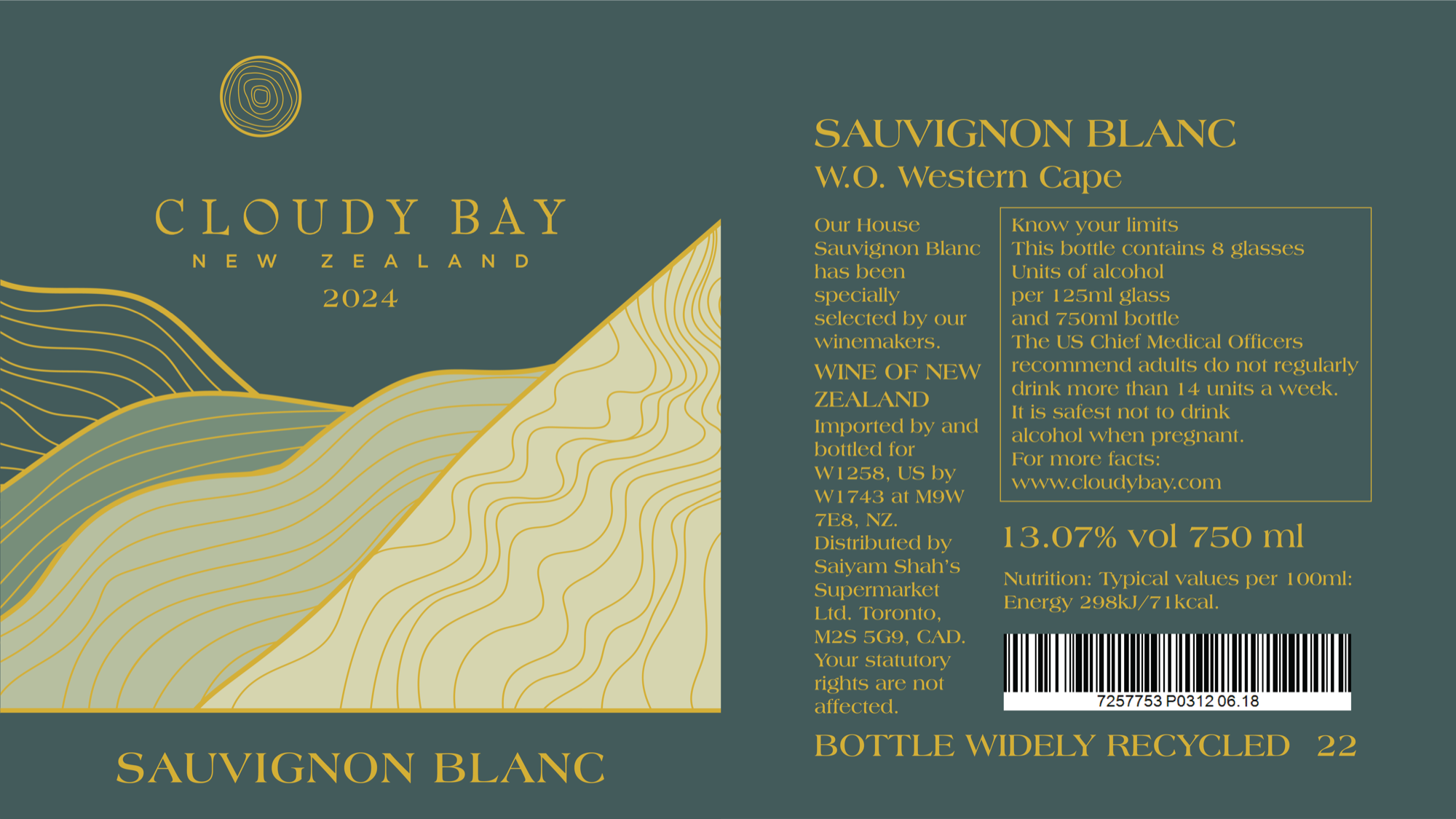
"New Zealand in a bottle. Marlborough in a mark."
Every detail — the weight of the typography, the proportion of the crest, the depth of the ground — designed to feel inevitable. Like it was always supposed to look this way.